Whilst researching into handwriting, the idea came to me of the link between handwriting and typefaces, by me saying handwriting is good, by no means am I trying to say that type is bad. There must be a perfect way to find the link between the two, one developed from the other and from this infusion, both have developed.
I found this article on a blog I was reading and it was perfect, it fits completely with the same sort of idea I was thinking. Where as this post is purely interesting in typographers handwriting I am more interested in any ones handwriting, however this post is really interesting.
Whilst designing type, there without a doubt must be an extraordinary link between the typographer, their personality and style and the typeface they want to create, what they want to communicate. Is this a direct link, can it easily be seen from handwriting to typeface. The typographers do after all influence us all, type is everywhere, it has an impact.
This is what was on the blog post, a number of prominent typographers that had been asked to send in a scan of their handwriting as we see it in relate to their type.
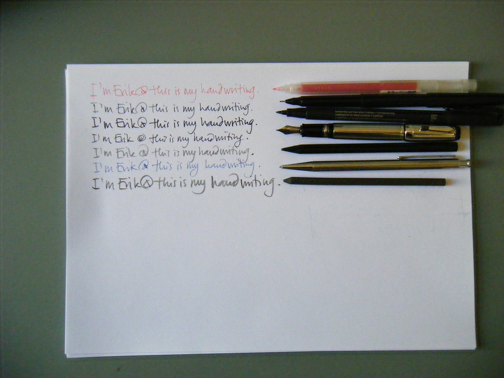
Erik Spiekermann
Erik is a renowned designer and typographer who has been involved in every facet of visual communication – practicing, writing and teaching, as well as running his international agency
SpiekermannPartners.
He has designed corporate typefaces for Nokia and Deutsche Bahn, as well as the fonts
FF Meta,
ITC Officina,
FF Info, LoType, Berliner Grotesk and many more.
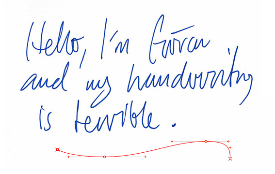
Göran Söderström
Göran Söderström began working at various advertising agencies before forming his own design studio –
Autodidakt – in 2006. Since then he has focused largely on type design.
Nikola Djurek
Nikola Djurek owns the type foundry
Typonine in Croatia. As well as running his own foundry, Nikola teaches in the University of Zagreb's School of Design and at the Academy of Art in Split. He is also the Croatian delegate for ATypI (Association Typographique International).
Sebastian Lester
Seb Lester is a type designer and
typographic illustrator who operates out of London. His beautiful type creations are used by Intel, Dell, The New York Times and The Sunday Times, amongst others.
Mark Simonson
Mark Simonson started out as a graphic designer and illustrator, transitioning to art director on several Minnesota-based publications throughout the 80s and 90s. In 2000, his interest in type design lead him to open his own shop specialising in lettering and typography.
Kris Sowersby
This New Zealander developed a love for letterforms in design school and has been infatuated ever since. He now produces stunning retail typefaces and custom typefaces for lucky clients. (He's one of my favourite typographers of the past few years.)
Kris collaborated with Erik Spiekermann and Christian Schwartz to produce
FF Meta Serif and has created several distinguished typefaces in his own right:
Newzald,
Feijoaand the TDC awarded
National.
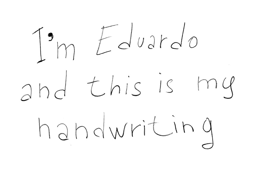
Eduardo Manso
Eduardo Manso had the usual stints in advertising agencies and design shops before settling in Barcelona, where he now freelances and teaches typography in several different schools.
Eduardo's typefaces have received numerous accolades including several TDC certificates of excellence for
Relato Sans and
Bohemia. Bohemia also won first place in the 2003 Linotype International Type Design Contest.
Veronika Burian
Veronika Burian originally studied as an industrial designer, but discovered her passion for type whilst in Italy. After receiving her Masters in Type Design she joined forces with José Scaglione to create the independent type foundry
TypeTogether.
Her typeface
Maiola received a TDC certificate of excellence, and she has since released several fonts in partnership with José:
Karmina,
Ronnia and
Bree.
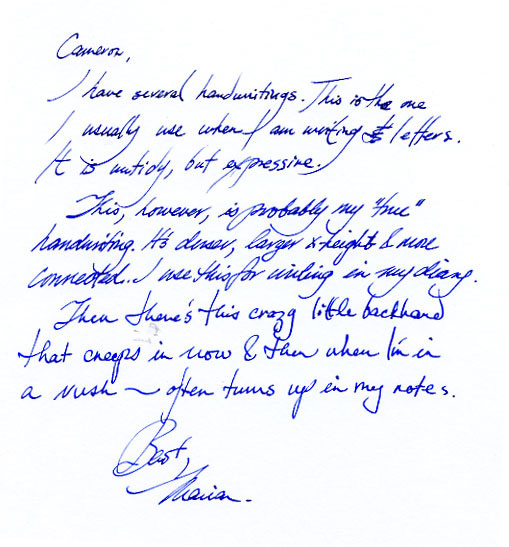
Marian Bantjes
Marian Bantjes has – for me – redefined what it means to be a typographer. She doesn't produce typefaces, and her most famous work doesn't involve typesetting paragraphs of text (although she certainly has that background). Instead, Marianillustrates type with a boundless freedom and intricacy that gives each of her pieces a unique, handmade appearance.
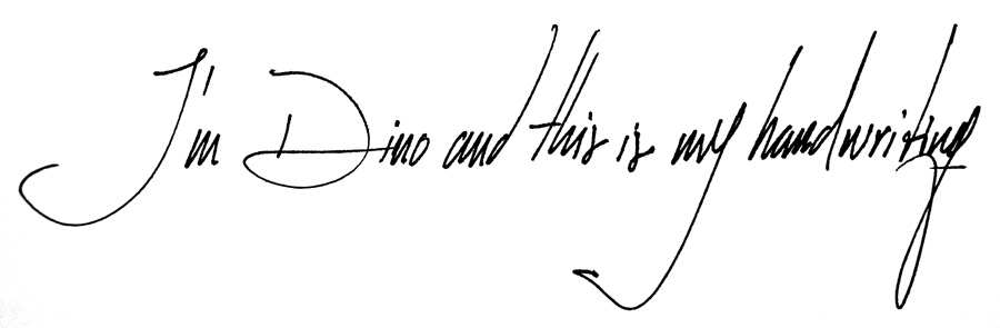
Dino dos Santos
Dino's studio,
DSType was started in 1994 and has focused almost exclusively on typeface design – both custom and commercial.
Dino's output of typefaces can only be described as prolific.
Ventura was awarded a TDC certificate of excellence and most of his other fonts – including
Andrade,
Esta,
Estilo and
Leitura – have either won awards or been featured in the top fonts for their respective years.
The results I thought were great, there was such a strong correlation between their own handwriting to the typefaces they've designed. It is really interesting to see, the personality that can be seen in their own hand, comes through into what they are trying to communicate. This therefore as a typeface, allows others to be able to pick a typeface to be able to represent what they want it too.
If anything this shows the importance of handwriting, and in such a digital age, we shouldn't lose focus off of handwriting, after all with out it we would never have this fonts from such prominent typographers and in the future if handwriting does become obsolete what would happen then to developing type design.


