Showing posts with label LIVE BRIEF: CONTEXT OF PRACTICE. Show all posts

BRIEF 04: SOCIAL MEDIA

The last lecture, number 14. Social Media and Communication.


The term Social Media refers to the use of web-based and mobile technologies to turn communication into an interactive dialogue. Andreas Kaplan and Michael Haenlein define social media as "a group of Internet-based applications that build on the ideological and technological foundations of Web 2.0, and that allow the creation and exchange of user-generated content." Social media is media for social interaction as a superset beyond social communication. Enabled by ubiquitously accessible and scalable communication techniques, social media substantially changed the way of communication between organizations and communities, as well as individuals.


BRIEF 04: RHETORICAL IMAGE

Rhetorical image, Roland Barthes discusses this in his book Image-Music-Text.


Simplistic, crisp design. Straight to the point, even though it is only one of the first pages in the inside of his book. Its got something I really like about it.

BRIEF 04: COMMUNICATION

Lecture 12 - Communication.

I would imagine this lecture is on communication theory and different models, thinking about my past experience and that Garry Barker is doing it.


BRIEF 04: HISTORY OF ADVERTISING

Lecture number 11.
Advertising, want something simple, someone holding a cheap printed sign, classic design for a low budget advert. Look at type, colour, hierarchy and format.


BRIEF 04: FASHION AS PHOTOGRAPHY

Fashion as Photograph: Viewing and Reviewing Images of Fashion


For lecture number 9, fashion as photography I found this book which was worth having a look at in order to give me a bettter idea of what I needed to produce.

Photography practises it includes are editorial and advertising, beauty, portrait and documentary.

"Photographic images are a driving force behind the fashion system, and they play a key role in defining global fashion culture. Fashion photography is attracting increasing public attention; it has embraced new image-making technologies, and has shown itself to be a commercially and ideologically powerful medium."

BRIEF 04: TYPE JOURNAL

TYPE JOURNAL, to help with poster number 8, a brief history of type. I am using my type journal as a reference point for particular typefaces from different eras in type history.

There is humanist, old style, transitional, modern and slab serif. Serif and monospaced type has not appeared but I found relative typefaces.


BRIEF 04: TYPEFACE FOR GIALLO

Thinking with type for the sixth lecture poster, italian vernacular film. Typical Italian typography, really well designed and well crafted, want to find something similar to Fabbrica and as bold as Giallo films which were produced in the 1960's, 70's and 80's. 

The typeface can often look distorted but I want something solid and crisp. 


Found something similar. Houschka Black is close for Fabbrica.


BRIEF 04: ITALIAN VERNACULAR CINEMA


LECTURE 6
FILM THEORY

3) Italian Vernacular Cinema


What is an Italian giallo film? Mikel J. Koven’s latest book La Dolce Morte: Vernacular Cinema and the Italian Giallo Film attempts to illuminate this under-appreciated cultural phenomenon and is in fact the first English-language academic study to do so. 


Literally meaning “yellow”, the term giallo here references the cover design of pulp fiction novels first produced by Italian publishing house Mondadori in the late 1920s. Initially, these were mostly translations of crime/mystery stories by writers like Agatha Christie and Edgar Wallace, but it wasn’t long before home-grown literary gialli began to appear. 


The book sets up a particular framework for the discussion of gialli which focuses on their status as “vernacular cinema”, explaining that “approaching the giallo as one would other kinds of Italian cinema…is not productive, as this genre was never intended for the art house, but for the grind house.” 


Bold colours, strong bold san serif typefaces, often with distorted effects or quite display typefaces. The type of cinema is a crossover between crime and fiction novels to cult films.


BRIEF 04: BREATHLESS/ À BOUT DE SOUFFLE

Breathless, famous scene from within the film of the duo. Followed by the original film poster when it was released. I really don't like the general style used in the poster, the composition, the type, the images, doesn't really work for me. But obviously if I am trying to convey the idea of French New Wave cinema and this is one of the most prolific ones, or at least one that is going to be spoken about in the lecture then I need to research more.


DVD cover design, using the same image that is the original poster design.


To get a better idea of what I am looking at, I have found more film posters for Breathless, some quite similar and others very different. This idea of misplaced type used in these posters works well, but am curious as to when it first came about. 
If I was to guess I would think the type is there like this to represent the character Polccard who is dubbed irresponsible sociopath, who is shown to be reckless throughout the whole film. Which is why I  particularly like the type in the second poster down, large, reckless and in your face. This similar sort of idea can be seen in the poster just below it as well.

Where as there are other posters, that seem to go with a whole other notion more focussing on the french romance side of the design, such as the fourth poster down.


Another reason the type could be like this is due to in the film the scenes had parts removed and creates jump cuts as a style of french new wave which was prominent.


A very new, fresh take on the design of Breathless. This indie style character design, which is good. Its appropriate and works well but not the route I will be going down for my type of posters.


Due to how the french new wave cinema had the collective idea of a self-conscious rejection of classical cinematic form and their spirit of youthful iconoclasm. The films themselves were on a tight budget and this what influenced the film and style even more so, so it leads me to think of poster design being cheap with prints of two spot colours at most, trying to limit overall cost. This is why I like the idea of this poster, even though it is four colours or three with a tint, I feel it communicates it.


And finally another film design poster, which is the image seen on IMDB. The poster is type heavy, with its rounded edges sans serif titling font. I like the simplicity of it and the use of verticals to create the composition.


Another image found which is for a film also down by Jean-Luc Goddard, a prominent pioneer of the french new wave cinema. Simplicity in its structure, see the use of the grid, which gives an international style feel to the poster. Quite modernist. Once again only two colours.


BRIEF 04: LECTURE 5.

5TH LECTURE. FILM THEORY 2.


'2) French New Wave as post-war cinema, looking at Cleo and Breathless.'


'The New Wave (French: La Nouvelle Vague) was a blanket term coined by critics for a group of French filmmakers of the late 1950s and 1960s, influenced by Italian Neorealism and classical Hollywood cinema. Although never a formally organized movement, the New Wave filmmakers were linked by their self-conscious rejection of classical cinematic form and their spirit of youthful iconoclasm. "New Wave" is an example of European art cinema. Many also engaged in their work with the social and political upheavals of the era, making their radical experiments with editing, visual style and narrative part of a general break with the conservative paradigm.'


BREATHLESS. 'Many of the French New Wave films were produced on tight budgets; often shot in a friend's apartment or yard, using the director's friends as the cast and crew. Directors were also forced to improvise with equipment (for example, using a shopping cart for tracking shots). The cost of film was also a major concern; thus, efforts to save film turned into stylistic innovations. For example, in Jean-Luc Godard's Breathless (À bout de souffle), after being told the film was too long and he must cut it down to one hour and a half he decided (on the suggestion of Jean-Pierre Melville) to remove several scenes from the feature using jump cuts, as they were filmed in one long take. Parts that didn't work were simply cut from the middle of the take, a practical decision and also a purposeful stylistic one.'


'Breathless (1960) had unexpected international successes, both critical and financial, that turned the world's attention to the activities of the New Wave and enabled the movement to flourish. Part of their technique was to portray characters not readily labeled as protagonists in the classic sense of audience identification.'


BREATHLESS STORYLINE


'Michel Poiccard, an irresponsible sociopath and small-time thief, steals a car and impulsively murders the motorcycle policeman who pursues him. Now wanted by the authorities, he renews his relationship with Patricia Franchini, a hip American girl studying journalism at the Sorbonne, whom he had met in Nice a few weeks earlier. Before leaving Paris, he plans to collect a debt from an underworld acquaintance and expects her to accompany him on his planned getaway to Italy. Even with his face in the local papers and media, Poiccard seems oblivious to the dragnet that is slowly closing around him as he recklessly pursues his love of American movies and libidinous interest in the beautiful American.'


BRIEF 04: VERTIGO TYPE

After researching Vertigo and ist design style and the hand rendered bespoke typeface for Vertigo which has been hand cut in order to create the jagged edges other than a typical serif or sans serif typeface. 

Here is a poster which promotes the typeface which someone has made in order to replicate what was originally used by Saul Bass.


BRIEF 04: VERTIGO

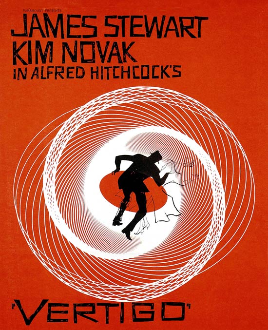
Film poster and openings for Hitchcocks film, designed by Saul Bass. Two colour print and hand cut type used for the typography, with its edgy feel to it the type has come from German design. The idea of the swirl and curves for this idea of vertigo and being lost into the warp.


Opening title sequence for the film. Due to the voyeurism within the film, showing close up of eyes for an intense eery beginning, with this dramatic effect into the swirls.


BRIEF 04: LECTURE4/ AUTEUR THEORY

AUTEUR THEORY


"In film criticismauteur theory holds that a director's film reflects the director's personal creative vision, as if they were the primary "auteur" (the French word for "author"). In spite of—and sometimes even because of—the production of the film as part of an industrial process, the author's creative voice is distinct enough to shine through all kinds of studio interference and through the collective process. In some cases, film producers are considered to exert a similar "auteur" influence on films they have produced."


The idea of auteur theory is that the director of the film can gain credit and authorship of the film, in order to attain their own personal style within the film. Which in turn makes the film more of an art direction from the his own point of view, as a distinct style which could be almost instantaneously recognisable.


Examples of this of course could be Hitchcock and Tim Burton.

BRIEF 04: LECTURE 4/VERTIGO


LECTURE 4- Hitchcock and auteur theory.


Article found on the Guardian (http://www.guardian.co.uk/film/2008/sep/26/poster.vertigo)


Perfect in relevance to what I need to research in to. 

LECTURE 4. INFO - e-mail I got in order to know more about the relevance of the three upcoming lectures 


"Hi,
 
I plan to do
 
1) Hitchcock and auteur theory – looking at innovation, style in Vertigo
2) French New Wave as post-war cinema, looking at Cleo and Breathless
3) Italian Vernacular Cinema looking at set pieces, product placement and audiences
 
Sam"


-----

Here the article refers to the main focus' of what I need to get across in the poster - from the auteur theory, to Hitchcocks style to the design of the film poster/ title sequence credits for vertigo designed by Saul Bass. 


Vertigo: Disorientation in orange

Paul Rennie explains the origins, details and consequences of Saul Bass' revolutionary design
Vertigo posterView larger picture
A detail from the poster for Vertigo. Photo: Kobal. Click the magnifying glass to see the full poster

Hitchcock goes to Hollywood

Hitchcock's arrival in the USA, in early 1939, gave him access to greater resources and to a global cinema audience. In the 1950s, Hitchcock was greatly admired by the young French film-makers of the Nouvelle Vague who recognised and promoted his work as that of a cinematic auteur and as a master of studio technique.
  1. Vertigo
  2. Production year: 1958
  3. Countries: Rest of the world, UK, USA
  4. Cert (UK): PG
  5. Runtime: 128 mins
  6. Directors: Alfred Hitchcock
  7. Cast: Barbara Bel Geddes, James Stewart, Kim Novak
  8. More on this film
The highpoint of Hitchcock's career is generally agreed to be the sequence of films beginning with Rear Window (1954) and continuing with Vertigo (1958), North by Northwest (1959), Psycho (1960) and The Birds (1963).

Hitchcock and voyeurism

Three of these films: Rear Window, Vertigo and Psycho, constitute a trilogy that explores the theme of voyeurism. This was especially significant in the later 1950s, as it introduced a psychological concept that had been explained to a popular audience, in part at least, by Freud.
The voyeuristic observer, hidden or otherwise, and with the obsessive personality associated with sexual dysfunction, became a staple, not just for Hitchcock, but for the whole of cinema. The cinematic experience became understood as psychologically contiguous to voyeurism. Hitchcock even developed a special zoom effect used in the film to suggest the sensation of vertigo.
The voyeuristic eroticism associated with Hitchcock's exploration of psychological suspense was heightened by the director's use of cool and elegant blondes. In Vertigo, Kim Novak leads.

Saul Bass

The poster for Vertigo is by Saul Bass, who was a pioneer of film-title sequences and of film poster design. Bass conceived the title sequence as an integral part of the film and as something that could, through the use of music, typography and moving image, establish the mood and emotional register of a film.
Before Bass, which is to say, before about 1955, film titles were presented as a throw-back to the silent era. Titles and credits were shown as a sequence of static cards with the acting and production credits drawn onto them.
The big colour productions of the 1950s greatly extended the production credits. Incorporating this extra information into the title sequence made it too long. Accordingly, the credits began to be organised so that title and big names were placed at the front of the film and production and general credits at the end. So, part of what Bass was doing was a pragmatic choice to organise this information clearly.
Bass famously worked with Otto Preminger and with Alfred Hitchcock. He designed the posters and title sequences for Vertigo, North by Northwest and Psycho. Martin Scorsese persuaded him to create the title sequence for Casino (1995).

Vertigo

The poster for Vertigo combines several elements that we've discussed previously. The design is based on a simplified two-colour process that uses hand-cut lettering against a bright orange background. The tiny portraits of James Stewart and Kim Novak are the only photo-mechanical elements in the design.
The technical specification for the poster reads as a screenprint. The small photographic elements, hand-cut type and solid bright orange are all indicators of this process. Accordingly, the film is positioned as an edgy and psychologically complex story, slightly outside the Hollywood mainstream.

Hand-drawn lettering and hypotrochoid curves

The tradition of hand-drawn lettering goes back to the German expressionist films of the 1920s. These films were pioneers of the horror genre and created a film world of oblique angles and vertiginous perspectives. The hand-drawn lettering for these films rejected the curves and serifs of traditional typefaces for something altogether more edgy and visceral.
The main visual element in the Bass poster is a geometric pattern based on hypotrochoid curves. These curves are familiar from the popular Spirograph toys of the 1970s. The curves provide a complex manipulation of the normal grid-spaces of our concrete and psychological environments.
-----
From this there certain themes and areas that I can extract in order to make it work for the design. 
Voyeurism, something that is definitely a theme within many of Hitchcock's films, which is a part of his auteur, as the creator of the film. Psychological point of view.
The hand rendered type style used, as spoken about above. It is hand cut lettering creating something 'edgy' and 'visceral'. German expressionist.
The curves as said to break away from the norm of grids, as a very structured thing which was a sign of times at this point. The curves also represent the disillusion, which vertigo is.
DIALOG WITH RICHARD

E-MAIL CONVERSATIONS with Richard in reference to the first lecture poster.


-FIRST E-MAIL.

Hi Richard, 

just thought I would send a quick message in reference to the posters, promotional work I can do for the first years lectures. I decided I would just keep it to Programme 2, for graphic design, creative advertising etc. and with the first lecture rapidly approaching I have been doing some designs but just wanted to find out if there is anything in particular that you would want to go on the posters other than the obvious, dates and times. 

Thanks, 

Niall

-FIRST REPLY

Not really, the only esential information is lecture title, date / time, lecturers names and e-mail address
I would like them to be as visual as possible though, hopefully with any images or typography informed by the content of the lecture.

Richard

-SECOND E-MAIL

I couldn't find you earlier, but I have left a copy of the poster in your office. If you could get back to me and let me know what you think, or let me know when you are free to discuss it, that would be great. Thanks
 
Niall


-SECOND REPLY


It's really good. Looks like something from the Bauhaus. I'm going to put it on the lecture theatre door right away.
Richard


-THIRD REPLY


Also, I've just been told that we shouldn't refer to Fashion Route A anymore and instead refer to Fashion (Concepts & Communication). Can we change this on future designs
Richard

-THIRD E-MAIL

Oh ok, thats absolutely fine, I'll make sure I do that. The image is maximum size jpeg so the quality should be fine. About sending it out via e-mail is that something you could do or should I find out from Amber? 

Niall


-FOURTH REPLY


I could send out a message via e-mail. Amber can do the tweeting and may have other ways of spreading info
Richard