Showing posts with label OUGD201. Show all posts

AMPERSAND

An ampersand (or epershand) “&” is a logogram representing the conjunction word “and”. The character is derived from the Latin word et, meaning “and”, was first written as two distinct letters, but over time the ‘e’ and ‘t’ were combined
The word ampersand is a conflation of the phrase “and per se and”, meaning “and [the symbol which] by itself [is] and”. The Scots and Scottish English name for & is epershand, derived from “et per se and”, with the same meaning.
Until relatively recently the English language was considered to have 27 characters in its alphabet, with the ampersand right after z. The recitation of the alphabet would end in: “X, Y, Z and per se and.” This last phrase was routinely slurred to “ampersand” and the term crept into common English usage by around 1837.
The ampersand can be traced back to the 1st century A.D. and the Old Roman cursive, in which the letters E and T occasionally were written together to form a ligature. In the later and more flowing New Roman Cursive, ligatures of all kinds were extremely common.
The ampsersand is not used within body copy, however it used to be - Gill used it frequently to adjust line length when setting text - but modern usage has it pretty much limited to combining pronouns in titles, company names and credits.
Due to its nature now and how it is used it has turned into a character that allows for such freedom within type design. And often can say an awful lot about a typeface as it is one of the only characters to have so much freedom.

AND PER SE AND, as a brand name for my t-shirts. Brings it back to its history to its very beginning of where its name originated from and when in time it was a character in the alphabet, and, and per se and is how you would say it. Not many people seem to know this, therefore is a way of teaching and letting people know of this. The brand can be taken to be very modern, freshing itself up from its history.

FINAL CRIT

FEEDBACK from Final Crit, in a group of six, each with our own partner to write notes and pointers brought up from within the crit.


Also with the notes I made after directly from the feedback that I got to really know what needed to be done and tested in time for the module submission deadline.

SO CALLED EVOLUTION OF TYPE TASTE

TYPE CALENDAR

365 TYPEFACES, 365 DAYS.


A tear-off calendar that showcases 365 typefaces from 180 designers. With a new font everyday, you can learn the background to each creation as well as other interesting details. Each designer being asked to contribute their favourite font.

Would be such a interesting and exciting calendar to have with each card looking completely different, packages all together in a lime green box, which would be a spot colour as it appears the product is only a two colour plate print, with black and green on white stock.

TRUTH

Brand identity designed for Nik Basran, didn't find many images but here can see a really nice spot varnish on what either looks like black stock or printed on black, after seeing what looks like the vector image of the design in the first place. Very smooth and eye catching, the initials of Nik Basran.

Love spot varnish.


TYPOGRAPHY DAY 2011


I just found out about Typography Day, spanning over three days, held in Mumbai, it showcases new and innovative typography as well discussing issues in the contemporary world related to typography. There are workshops, presentations and experts from all over participate in the sessions.

This will be the fourth year running, and this is the official information about the event.

----
Typography Day 2011 is being organized at the National Institute of Design, Ahmedabad in collaboration with the Industrial Design Centre (IDC) at the Indian Institute of Technology Bombay (IIT Bombay) with support from India Design Association (InDeAs).
The event will include a seminar which will be devoted to addressing issues faced by type designers, type users and type educators. The program will feature presentations on the first two days followed by day of workshops dedicated to typography and calligraphy.

The event is planned over three days,
Day 1-2 : Seminar focusing on ‘Typography and Expression’
Day 2: Workshop on Typography/Calligraphy

Themes

The Seminar will focus on, but will not be limited to the following issues:
  1. Typographic experiments and explorations with respect to Expressive typography.
  2. Typographic expression using multilingual scripts.
  3. Typographic expression in native (indigenous) Scripts.
  4. Typography as an expression of local contextual design.
  5. Research activities in expressive typography.


As part of this organisation I intend to run my exhibition focussing on current issues of handwriting, to promote handwriting and the relationship it has with typography. This can run in conjunction with the exhibition, but held in Leeds, clearly not everyone will be able to travel to India to celebrate the art of typography. 
It can be international.


ULTRA: STUDIO

From Swiss design company, Ultra: Studio branding and identity for designer Oliver Kamm. The branding and identity put to Oliver Kamm I think is very clever, it is straight to the point how to market the man himself, KA for Kamm, in a circle. The design is crisp and clean with a thin sans serif typeface used, reversed out from the black circle, the K is made up from the noticing the following letter A as it is on its side.

It is this logo that is therefore the focus point of the whole design, the following business cards that all very in colour and stock considerations. From glossy to matte, to textured and to what looks like more economical paper, all show a varied outlook which works well.
The rest of the design is very minimal working with very neutral colours for the whole card, and the only other information aspect of the card is Oliver Kamm's contact information which like everything else is kept exact for each card including the colour unlike the rest. 
The design is good promotional material, it is clean and crisp and personal to the designer for all to remember in future, it is recognisable.


I SHOUTED GUN

This is once again a identity design I found that Give Up Art had done, from research it appears that I Shouted Gun are a relatively small band however as soon as I saw the the design I thought it was really nice. The design is to the point and what I really like about it is the use of breaks I guess between the words, although sounds simple it is really affective and creates a sort of rush and panic, ideally suited to the name of the band.
It is the initials on there own I think works the best, once again even more panicked and important it is very crisp and clear too, with the extra simplicity of simply using black.


ILOVEDUST PROMO

MEAT PACKAGING


Meat packaging designed by ILOVEDUST as a promo piece, the packaging is not your average design for meat wrapping that you would find in the supermarket, it is a very high class print that seems to mimic the traditionalism of decorative type but with a completely new spin on the design to make it fresh and new. This is of course added to from the use of silver foiling as type and image on the card that comes with the product. Against the bright turquoise, which is probably a spot colour, the design is very eye catching and distinct.I think silver foiling looks very professional and chic, which probably really steps the design up.

The way the product has been packaged is very hearty and traditional yet again, but because of the design it takes away from a simple traditional piece of work from years and years ago, and it becomes something special that seems to have value, even if what is tying it up just brown what looks quite rough string, it adds to the value of it.

FWD >>

FORWARD identity design by GIVE UP ART

FWD >> is a dubstep and grime club in London and is well known for the being one of the first clubs of its kind. This is Give Up Art's identity and print design for the company. Similar to Apple Pips, in the way that the design is simplistic and strong but with this however the work is a lot more forceful, in the way that it is hard edged and angular it brings the design to be to the point. Or in other words the design could be quite forward in its mannor, the type really speaking the voice of what the club is called, and therefore the company is speaking what it tries to be.


I think the shortened version is really nice, even more to the point and clean cut, works really well both in conjunction with the original and on its own.
Very simple poster promoting a night on at FWD >> where you can see the identity in practise.

APPLE PIPS

APPLE PIGS
BY
GIVE UP ART

Design by Give Up Art for Apple Pips, which is a record label recently set up by DJ and produced Appleblim. The label needed an affective identity which can be seen here. I think it works really well, like any good branding of identities it is clean cut and fresh, the design has been simplified down to shorter logo as well that follows the form of the design of the name.

The design has obviously come from the name, but is delivered in a way that clearly seems well resolved, both from the design and it is well suited to the style and area of what the company does. It is relevant design to the audience and I would say encaptures the era of the music it is producing, fresh and stand out.


Print production of Apple Pips Recordings, still with the logo adding to the all round brand of the company a simple die cut has been used for the A and P, die cut can be such an effective delivering method instead of simply printing it creates a more interactive and interesting product.

AN IDEA

An idea on how to convey the representation of handwriting and type working together, especially within the relationship of 'my handwriting, and favourite typeface'. 


Want to play of illustrator or draw type as it can merge between the two, changing from one to the other. Think this could be an interesting way to start to play with design as handwriting and type really come together.

The second was simply the idea of overlaying the handwriting and type, first of all to see the difference between the two at face value, where similarities lie and parts of type that extend out. The second reason why I thought this could work quite well with the project was play with colour. This could include using different colour systems, overprint fill and or knockout to see the affect as each time it changes.

RATIONALE


HANDWRITING OF THE FAMOUS AND INFAMOUS

SHEILA LOWE's
"With more than 35 years experience in the field of handwriting, Sheila Lowe has been qualified as a handwriting expert in the California Court system since 1985. She holds a bachelor's degree in psychology and was certified by the American Handwriting Analysis Foundation (AHAF) in 1981, as well as the Society of Handwriting Analysts in 1985. She is an active member of the National Association of Document Examiners."


This book has undergone looking at the handwriting of various people, writers, politicians, musicians there a plenty of historical figures and cultural legends dating back to the 15th century. Sheila is fascinated with handwriting and analysing what each individual persons handwriting says about them, here she has pieces of writing from all these people, whether letters, poems, scripts or stories.


JANE AUSTEN


Short biography of Jane Austen, looking at the contextual and cultural side of Austen in the time she lived and worked. She started writing in 1787 had had her novel published in 1811. 


Jane Austen grew up and was well educated but still lived the life of an ordinary woman, which is why her work became such prevalent literature, and cultural.
Sheila looks at different subjects within her subjects, including Personality Overview, Relationships, Intellectual Forces, Physical Drives and Motivating forces.

Jane Austen is seen to have a handwriting style usually seen in modern young women at the time with a focus on movement, narrow margins and a strong right slant and long lower zone. This means she was probably a young woman, easily bored whose interests encompassed a wide range.


It is simply things like this that I am not sure how much I trust graphology and am quite sceptic as to what is being portrayed, however I think it is very interesting still to look at the handwriting of such a famous writer for example. It is historical as is she, I mean I myself am not a fan per say of Jane Austen but I sure can appreciate how well a writer she is and how much of a massive impact she had on people.
If she wasn't taught to write, and be so well educated from her father and couldn't simply just write and write she never would have been anybody. Her writing is incredibly famous and she has made a remarkable difference from doing so.

PROGRESS TUTORIAL

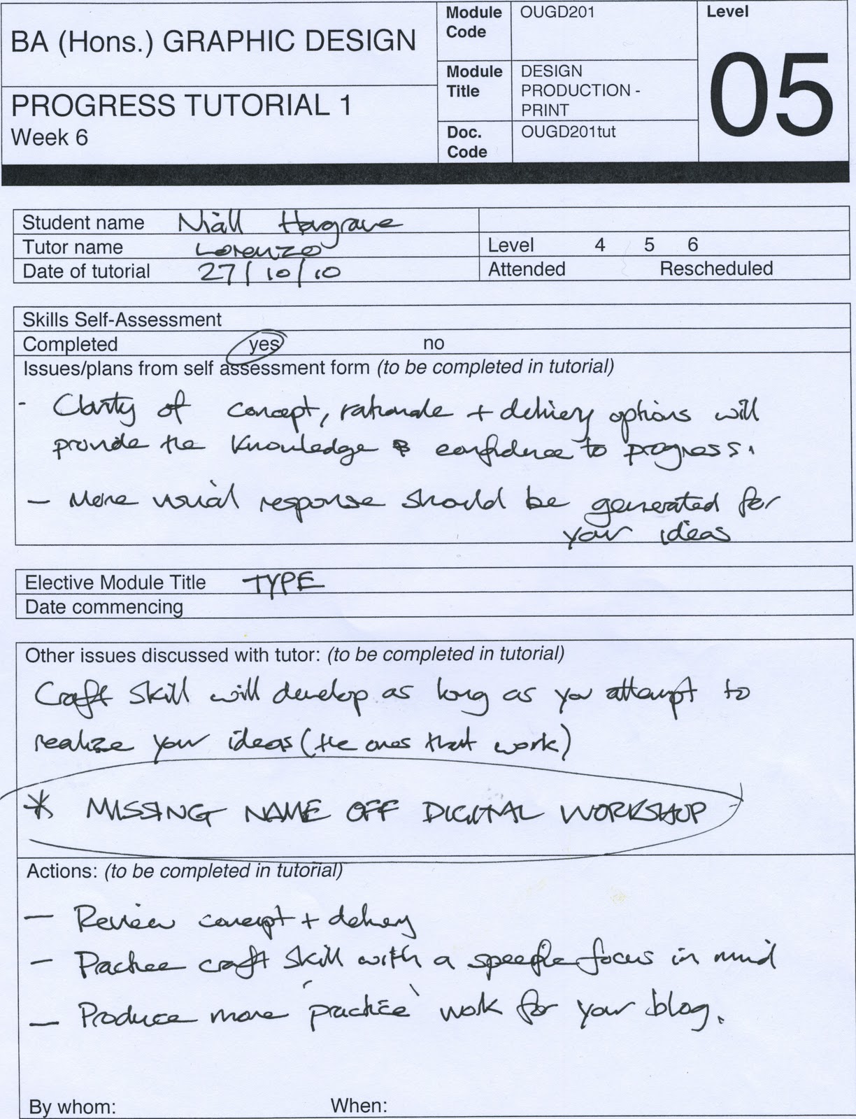
Progress tutorial with Lorenzo on Wednesday 27th.


From the progress tutorial it came apparent that I would need to have a constant flow between my research and design, by working for a certain period and start researching again when I need to it will create a more consistent way of being able to problem solve, resulting in a clearer and more concise message.

Things to look at from the tutorial:

The value of handwriting and how throughout time, this value has been recognised.
Famous and historically pieces of handwriting.
Love letters.
Letters from children. 

By now looking at a wider scope again it could bring me to something else, or in turn lead me back to something I have already been working on. This would create a stronger concept.

Where would my solution be seen? Who needs to see it?

-Newspapers
-Milk cartons 
-Posters - Ad shells - Bilboards.
-Mail shot

THIS IS MY HANDWRITING...

Research into other peoples handwriting and to see what their favourite typeface is. This is what will be the basis of my design and and research to find out the correlation and to see the link in each individuals handwriting and what they have declared their favourite typeface to be.


GOOD IS HANDWRITING

I think that handwriting is good.

WHY?
1. It shows an individuals personality.
2. Everyones handwriting is different
3. It is now relatively rare, has value to it
4. The link of personality through handwritten and type
5. I think it looks good.

I INTEND TO-

Promote to

...A GROUP OF-

Type Enthusiasts

...THAT

Handwriting and type are both Good, it is through the personality that is within each, that is what makes it really interesting, why the person has decided to use this specific typeface and how it relates to how they write.


IN ORDER TO ACHIEVE THIS I WILL PRODUCE-

An exhibition of handwriting and typefaces together. A series of posters to focussing on different peoples handwriting and favourite typefaces. This will be promoted through a mail shot and poster.

THIS WILL BE PRODUCED USING

Lithographic, with the added use of Spot varnish and Embossing.

EMBOSSING AND DEBOSSING

Embossing is a printing technique which creates a pattern on a material such as paper, metal, fabric, leather, or wood. The pattern can be raised or in relief, therefore depicting whether it is Embossing or Debossing.
Embossing involves a separate stage in the production process, after any varnishing and laminating. This process costs as much as printing. Many consumers interact with embossed items on a regular basis, ranging from embossed book covers to postage stamps.

A die embosses a single piece of material at a time, but it can be used again and again. With both dies and rollers, the pattern to be embossed is carved in reverse, so that when the die is pressed against the material, the desired pattern will show up in the correct form. Typically, a die is designed to be mounted into a press, and is not hand-held. Both dies and rollers also may use heat in order to be more effective.

In printing, embossing can add a great deal to printing costs. Embossing represents a separate run through the press, usually, unless a die is designed to be inked. More commonly, printed materials are “blind embossed,” meaning that they are embossed without the use of ink. When blind embossing is used, it is important to ensure that the embossing die is properly registered, so that it will mesh with the inked patterns which were produced first.


FOIL STAMPING

FOILING, OR FOIL STAMPING


Typically a commercial print process, it is the application of metallic foil, often gold or silver , but can also be various patterns or what is known as pastel foil which is a flat opaque colour or white special film-backed material. It is applied to the substrate, where a heated die is stamped onto the foil, making it adhere to the surface leaving the design of the die on the paper. 

Instead of using magnetism, plates, or inks to print words and shapes, foil stamping uses dies, or sculpted metal stamps. The heated dies seal a thin later of metallic leaf onto a surface. The foil comes in a wide roll, large enough for several passes, backed by Mylar. The hot die works similarly to a letterpress. Once heated, it presses the foil against the substrate material with enough pressure that the foil sticks only in the intended places, leaving a slight imprint.

Using several layers of foil in different colors or combining ink and foil can embellish this simple "flat" stamp. Imprinting and embossing adds even more dimensionality. The edges of the foil stamp may be straight, curved, or sculpted to make the image pop or float above the page, which makes more of an impact.

Foil leaf is available in every imaginable colour and pattern, like standard gold or marbleized green. Rarer types of leaf come in matte, pearlescent, holographic, opalescent, or glossy finish. Semi-transparent layers allow an under color to show through. Not only does it provide a uniquely vibrant image with depth, foil stamping can be applied to a much more diverse selection of substrates in comparison to ink.


Foil stamping machines, also known as hot foil stampers, use heat to transfer metallic foil to a solid surface. Examples of items that are foil stamped include pencils, napkins, matchbooks, photographs and books. The foil stamp is a permanent process. These machines are popular with wedding businesses, photography studios and other businesses that need to brand or mark products.


There is a similar process similar to foil stamping and creates a very similar look, the process is called foil fusing in which foil is fused to printer toner by means of heat.


There are two primary types of foil stamping machines. The first type is manual and the second is pneumatic (air powered). Manual foil stampers are ideal for low to medium volume jobs and the pneumatic is ideal for medium to high-volume jobs.