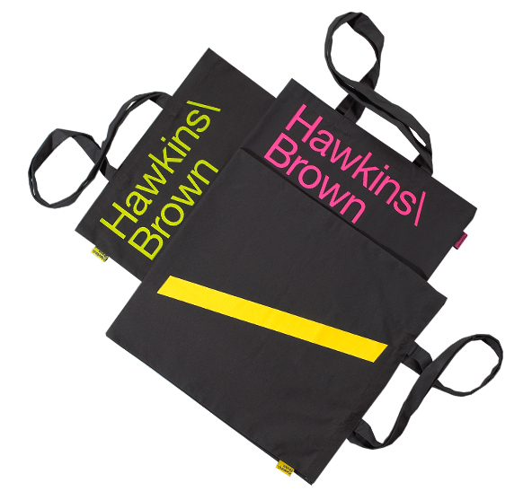
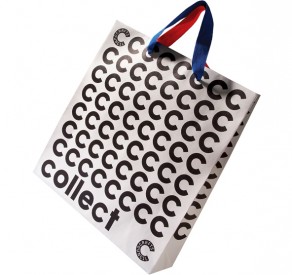
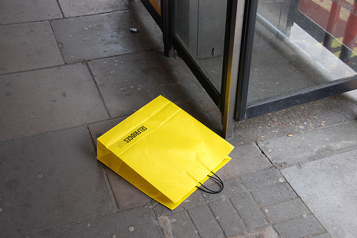
Looking at some retail bags for inspirtation for my own bags I intend to design and make. Here there are some that are plain and simple, brown paper bags, where as others are made from fabrics that are tote bags. I plan on making paper bags that support Transgressive fiction and Waterstone's.
Showing posts with label BRIEF:01. Show all posts
BRIEF 01: PAPER BAGS
In order to bring the whole project together I am intending on designing paper bags for in store at Waterstone's, branded with Vintage Transgressive to give away once purchasing the book. This then carries on the promotion where anyone goes once they have bought something from the shop.
Just like the posters I intend to have one bag for each book, therefore a different colour for each.
Here are some nets I have been researching order to make my own. This is sort of a general formula in order to design the layout of the bag.
This is definitely a much more simple template of a net to make a bag, I would think a bit too simple.
Here I found a site where you can download the eps file of the net you want, depending on the size of the bag you want to make. These are some of the options for sizes, the most appropriate size for my books would be 10x5x13. And underneath is the actual net.
BRIEF 01: SELLING MY COLLECTION
In order to promote my collection of Vintage Transgressive, a series of six books I have decided to sell and promote them through Waterstone's. In my own opinion the best and only appropriate book store still thriving.
However they have recently had a re-brand and according to Creative Review did this with branding agency venturethree. Waterstones have gone from a very classic design, using a beautiful serif typeface and transformed it into a simpler, apparently more modern sans serif design.
So working with the new re-brand within my designs, I have posters that will be promoting the collection and will of course be including Waterstone's logo on it so everyone knows where. These posters will be in and around Waterstone's.
BRIEF 02: ANOTHER POSSIBILITY
Possibility of another transgressive novel to chose from, Fear and Loathing in Las Vegas, by Hunter S. Thompson. This novel and film received huge acclaim, chasing the american dream on a huge drug roller coaster.
FEAR AND LOATHING IN LAS VEGAS
NOVEL//WIKI
FILM//IMDB
I might not necessarily do all of these books but I will have to consider which of the rest to do, or which are best suited for it.
BRIEF 01: THREE MORE NOVELS
From crit feedback, there was a universal decision that adding more books to the collection would make sense and be a great idea. I originally was thinking because there are other novels that have gone to be big in the film industry that are transgressive fiction that I could create the collection so in the future other novels could be added but I decided would be best to add them now.
I have decided to add the following novels/films. That are both significant as books and film.
There is Trainspotting, Crash and A Clockwork Orange
TRAINSPOTTING
NOVEL//WIKI
FILM//IMDB
CRASH
NOVEL//WIKI
FILM//IMDB
A CLOCKWORK ORANGE
NOVEL//WIKI
FILM//IMDB
Trainspotting became a very famous film, directed by Danny Boyle, looking at a group of friends in Edinburgh who are heroin addicts. Both novel and film were well received so fits right into my collection.
Crash, written by J. G Ballard is an unusual story of car-crash fetishism. Receiving pleasure from real life car crashes. The film was not as well received internationally as the others but still important cult film.
A Clockwork Orange, hugely popular both in novel and film. Stated to be a dystopian novel it still is a work of transgressive fiction too. As it deals with problems in society, reacting to this and psychological manipulating.
THE NEXT THREE ON THE AGENDA.
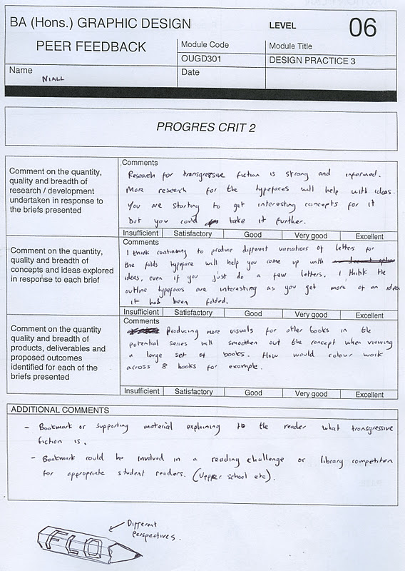
PROGRESS CRIT TWO
Second crit with the same group, yet this time Jo wasn't in and Jack joined our group. So it was Ben, Emma, Liz, Jack and myself, which I think was a really good group to crit each others work. Here is the feedback I received from them within the Crit.
I got some good feedback from the crit. So in order to make sense out of these sheets I have gone through them and just made my own quick list of things I need to do, and things I should just try out and test.
Some of the things suggested I didn't think were entirely relevant to my work, or I had already thought about it and decided not to. Everything else is on the list that I need to get stuck in to.
FIGHT CLUB RE-DESIGN
I came across this design earlier of Fight Club by Chuck Palahniuk. I quite like it, use of a serif typeface, similar to Bell MT. I'm not sure what the objects in black are, all I know it appears quite similar to what I was doing but hadn't seen this before. Using it to create the negative space for the type to go on works well. I find the back cover to be too busy for me, too much type.
Its also says its published by Vintage which is also interesting.
VINTAGE LOVES FILM
The concept behind the ideas are good, linking quotes of the story into the design of the books is a really good idea. I have picked out Fight Club as I am doing Fight Club and also Trainspotting because it as well is a Trangressive fiction.
Executed well, it is exactly the type of work I like, due to the heavy use of type. It is a very different take on the book covers to what I have and am thinking and I do really like what has been done but I am trying to get across something different, but still could use this as inspiration to the rest of the brief.
QUOTES OF BOOKS
In order to give my book covers the credit to make them look official and real life there were two important things I had to add.
One to put quotes from various established newspapers, or critics.
Here are the quotes I chose.
FIGHT
CLUB
“Diabolically dark and funny writing”
THE WASHINGTON POST
“A memorable debut by an important new writer.”
Robert Stone
“A dark, unsettling and nerve-chaffing satire”
SEATTLE TIMES
REQUIEM FOR
A
DREAM
“This book marks Selby as a major American author”
LOS ANGELES TIMES
“Selby places in the front rank of American novelists.”
THE NEW YORK TIMES
“One of the greatest American novels of the century”
THE NATION
AMERICAN
PSYCHO
“Serious, clever and shatteringly effective”
SUNDAY TIMES
“A beautifully controlled, careful, important novel.”
Fay Weldon,THE WASHINGTON POST
“Mean and lean horror comedy classic”
NEW YORK TIMES
REQUIEM FILM POSTER
REQUIEM FOR A DREAM FILM POSTER
by Excites.
by Excites.
The design is not something that is entirely suited to me, however I just like how it has been explored and thinking of where the concept for it has come from. The colours are interesting, bright and experimental like what I am trying to produce in my own designs to a certain extent.
VINTAGE
NEED A PUBLISHER FOR MY BOOKS
Its publishing list includes world literature, fiction, and non-fiction. Vintage is one of the biggest British publishing houses of trade paperbacks.
It is a subdivision of Random House publishing, which is in turn owned by Bertelsmann, a German media conglomerate.
In 1990 Vintage was set up in the United Kingdom. This division independently from the American company although both are part of Random House.
------
Chose Vintage Books because it seemed appropriate looking at other novels that are under Vintage, very well suited books. It is a good company, one of the biggest British publishing houses as it says. They do a lot of different collections, and affairs to do with certain books if its an anniversary for example.
Two books published by VINTAGE. Both by Irvine Welsh, another transgressive novelist.
TYPE DIRECTORS CLUB
Book design for Type29. Type design turned pattern/ symbols. The type has been turned into black and yellow halfway through each letter, creating strips of colours. The 29 standing vertically works great in contrast to the rest of the type, making it stand out but still being a part of the design.
VOID ()
Found on designspiration, by qubik.
Take inspiration from these two images for my book design. I like the simplicity of this design, the type runs across the whole page, and because it is just this type as the focus of the page it is effective as there is nothing else to distract.
This because of the high impact of the image. Strong contrast to make the design as bold as possible. Something I could think of doing for my designs by working with the negative.
GABRIELE WILSON
Chosen simply for the type, and how its been played with for fragments. I like the idea but initial reaction was that it might have worked better with another typeface. However I do think it works and I like how the white type sits over the image.
FOUR BRIEFS EDITED AGAIN
Briefs changed again for the time being. Type design brief in particular after talking to Ric Bell, my original idea was to design a new grotesque but that would far to big for a brief if I was to design the typeface properly. Ric Bell suggested coming up with a concept to work the typeface.
& istd
& istd
Labels:
BRIEF: 02 - FOLD TYPEFACE,
BRIEF: 03 - ISTD,
BRIEF:01,
OUGD301
REQUIEM FOR A DREAM
First edition book design for Requiem for a Dream, in 1978, and is my favourite. The type demanding and intrigues the reader, it is bold and attracts attention whilst the layout shows confinement. Couldn't find an image of the back unfortunately. Like the colour choice, has impact.
Book design by Eleanor Rose, still from the film but the design takes a different route focussing more on a personal level with the type being quite informal but I can see why a typeface like this would be used.
Book design since the film, using imagery from it. The typeface is also the same as used for in the film, which does work really well. The type has personality but at the same time reflects a coldness.
Book design by Eleanor Rose, still from the film but the design takes a different route focussing more on a personal level with the type being quite informal but I can see why a typeface like this would be used.
I don't feel like this design works very well, the image is of a pill dispenser or the week with it overspilling at the end, but the colour of I feel is too weak, baby blue, doesn't have any emotion behind it, any taboo.
FIGHT CLUB
Design that reflects the idea of roughness of the novel, the use of colour in the type and in the image at the bottom of the cover, hard to work out what it is but the use of change the creases reflects a more grimey look at the novel. The type is strong, bold and effective but kept simple.
I like this design, it has a focus on the soap from the novel, which works really well on a black background but what I particularly like is the type used. The two different colours for both the title and the authors name, and how they overlap. It brings the type together but creates tension as well, it is bold and dynamic.
I don't really like the next two designs at all. The first one has these red lines over the top which makes me think it is trying to suggest how bold and out there it is but feel like it inhibits the design, simply because it hasn't been done right.
This design just feels weak to me, the image is of the man about to get punched with the shadow appearing to be smiling, which is a good idea but has not been executed well. The type appears to have just been put on anywhere and doesn't stand out for itself.
This image is a lot better, photograph simply showing a bleeding lip, this is giving the idea of any man, any man could be involved in something like this. This is the whole of idea of the book, that no matter who you are, what job you have when you got to fight club it doesn't matter. The type is simple, and works well with the image, anything else might have been a bit much.

Subscribe to:
Posts (Atom)