The last lecture, number 14. Social Media and Communication.
The term Social Media refers to the use of web-based and mobile technologies to turn communication into an interactive dialogue. Andreas Kaplan and Michael Haenlein define social media as "a group of Internet-based applications that build on the ideological and technological foundations of Web 2.0, and that allow the creation and exchange of user-generated content." Social media is media for social interaction as a superset beyond social communication. Enabled by ubiquitously accessible and scalable communication techniques, social media substantially changed the way of communication between organizations and communities, as well as individuals.
Showing posts with label OUGD301. Show all posts
BRIEF 04: RHETORICAL IMAGE
Rhetorical image, Roland Barthes discusses this in his book Image-Music-Text.
Simplistic, crisp design. Straight to the point, even though it is only one of the first pages in the inside of his book. Its got something I really like about it.
BRIEF 04: COMMUNICATION
Lecture 12 - Communication.
I would imagine this lecture is on communication theory and different models, thinking about my past experience and that Garry Barker is doing it.
BRIEF 04: HISTORY OF ADVERTISING
Lecture number 11.
Advertising, want something simple, someone holding a cheap printed sign, classic design for a low budget advert. Look at type, colour, hierarchy and format.
BRIEF 04: FASHION AS PHOTOGRAPHY
Fashion as Photograph: Viewing and Reviewing Images of Fashion
For lecture number 9, fashion as photography I found this book which was worth having a look at in order to give me a bettter idea of what I needed to produce.
Photography practises it includes are editorial and advertising, beauty, portrait and documentary.
"Photographic images are a driving force behind the fashion system, and they play a key role in defining global fashion culture. Fashion photography is attracting increasing public attention; it has embraced new image-making technologies, and has shown itself to be a commercially and ideologically powerful medium."
BRIEF 05: TYPEFACE
A monospaced font, also called a fixed-pitch or non-proportional font, is a font whose letters and characters each occupy the same amount of horizontal space.[1] This contrasts to variable-width fonts, where the letters differ in size to one another.
The first monospaced typefaces were designed for typewriters, which could only move the same distance forward with each letter typed. This also meant that monospaced fonts need not be typeset like variable width fonts and were, arguably, easier to deal with.
Inconsolata is an open source font created by Raph Levien and released under the SIL Open Font License. It is a monospaced font designed for source code listing, terminal emulators, and similar uses. Its design was largely inspired by humanist designs. It is largely influenced by the proprietary Consolas monospaced font, designed by Lucas de Groot, the proportional Avenir and IBM's classic monospaced Letter Gothic.
Neo Sans and Neo Tech are the typefaces designed by the British type designer Sebastian Lester. The typeface was released by Monotype Corporation on April 19, 2004. The design concept called for a versatile, futuristic typeface that didn't look "crude, gimmicky or ephemeral". The font was released with a companion typeface called Neo Tech
BRIEF 04: TYPE JOURNAL
TYPE JOURNAL, to help with poster number 8, a brief history of type. I am using my type journal as a reference point for particular typefaces from different eras in type history.
There is humanist, old style, transitional, modern and slab serif. Serif and monospaced type has not appeared but I found relative typefaces.
BRIEF 04: TYPEFACE FOR GIALLO
Thinking with type for the sixth lecture poster, italian vernacular film. Typical Italian typography, really well designed and well crafted, want to find something similar to Fabbrica and as bold as Giallo films which were produced in the 1960's, 70's and 80's.
The typeface can often look distorted but I want something solid and crisp.
Found something similar. Houschka Black is close for Fabbrica.
BRIEF 02: MADE IN BIRMINGHAM
STUDIOMAKGILL / COLOPHON FOUNDRY
Two years after creating the original identity and typeface for the Made in Birmingham exhibition, we created a more refined, commercial version of the typeface, Central Avenue.
After working with this typeface almost exclusively in black and white, we felt that it would be more interesting to explore it in colour for the type specimen. The unbound booklet also works as a series of 4 posters — abstract and bright.
Central to the identity was a bespoke typeface that we created based on the original hand-painted signs from the show. The typeface that they used wasn’t a typical decorative Victorian face, it was a simple sans serif – much more industrial and much more relevant for a contemporary exhibition.
Two years after creating the original identity and typeface for the Made in Birmingham exhibition, we created a more refined, commercial version of the typeface, Central Avenue.
After working with this typeface almost exclusively in black and white, we felt that it would be more interesting to explore it in colour for the type specimen. The unbound booklet also works as a series of 4 posters — abstract and bright.
Central to the identity was a bespoke typeface that we created based on the original hand-painted signs from the show. The typeface that they used wasn’t a typical decorative Victorian face, it was a simple sans serif – much more industrial and much more relevant for a contemporary exhibition.
The typeface created is strong bold, and industrial. However the colours and overlap texts makes for a really interest contemporary design. Bright and exciting, the letters sit as the composition of the page and he text is set over the top.
Try something similar myself.
BRIEF 02: FORMAT IDEA
Found on www.niessendevries.nl again, which could be a really nice and appropriate layout for my typeface publication. With adjustments obviously, it could be a great way to slowly unveil the my typeface through using the statements I have gathered including 'Opening a fold in a surface creates spaces.'
Each couple of words could appear in a new fold out, repeated and mimicked on the reverse to finally reveal and double page spread size poster in the centre, displaying and showcasing my typeface, or all four of them.
BRIEF 03: PHOTO ARCHIVE
NIESSEN·&·DE·VRIES
OBSERVE:All photographs in this book were taken bij Auke de Vries (sculptor, 1937 NL well-known for his sculptures in public space) between 1995 and 2005 as sketches for his work. These photographs - a selection from his photo archives.
COLOUR:Unlike an earlier booklet containing black and white photographs by De Vries, this publication is very colourful. This is because colour has played an ever more important role in Auke de Vries’s work. 16 different colours were distilled from the photographs and randomly used as a background for the photos.
EIGHT·COVERS:Eight·covers: The books are sold sealed in order to protect them. To offer a glimpse of the content each package comes with one of the 8 different photographs.
A photo book done my the Dutch design studio, it is so easy to see how everything they do is done for a reason, and it is so handy that they explain why they have done each thing as well. Such as the colours used for the background pages of the photographs, it is to show how the use of colour was very important for the photographer, so 16 colours from the photographs themselves have been used as the backgrounds.
BRIEF 02: ANNUAL REPORT
NIESSEN·&·DE·VRIES
2006 · Annual Report 2005 · Stedelijk Museum · 16 x 23 cm · 176 pp
Awards: Best book designs, NL · Schönste Bücher aus aller Welt, Leipzig 2007
STEDELIJK:the cover of this annual report consists of nine illuminated characters: S; T; E; D; E; L; I; J and K, printed in silver on a blue canvas, these characters come back as chapter dividers inside the book.
JAPANESE·BINDING:a way to bind books that gives the book a luxurious feeling; it makes the book easy to flip through; the Japanese way of binding is technically the best option because of the decorated margins.
Niessen and de Vries have created this really nice annual report, the type used on the front and back cover works really well, engaging with pattern again the design is perfectly communicating the museum, for example the use of nine blocks of pattern and nine letters in a 3 x 3 grid is to communicate the nine departments within the museum.
Really interesting piece of design to look at.
BRIEF 02: EXPERIMENTAL POSTER
NIESSEN·&·DE·VRIES
Graphic designers Richard Niessen & Esther de Vries
info@niessendevries.nl · +31(0)20 66 33 323 · +31(0)6 24 27 22 41
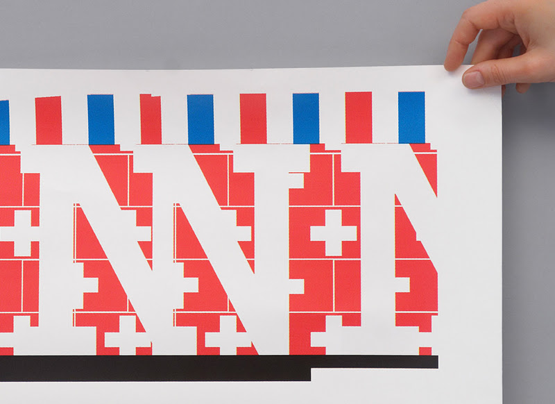
SLOGAN:'Donner au train des idées d’avance'. Slogan to celebrate the 70 years of the Société Nationale des Chemins de fer Francais (SNCF), this slogan had to be visualized on the poster.
CROPPED:the letters of the sentence 'Donne au train des idées d’avance' are cropped as if it were a panorama seen through the window of a moving train.
FLAGS:the high-speed trains of the SNCF run through eight different countries; the flags of these countries are incorporated in different patterns depicting a journey through all these countries.
The use of type is here is very experimental, the use of positive and negative space to create areas that pop and the patterns that create this visual texture over it. The colours and patterns are due to conveying the different countries, but it all jells so well together, very experimental and exciting.
BRIEF 03: STUDIO LAUCKE SIEBEIN
Booklets designed for Berlin based photographer Oliver Vaccaro.
studio-laucke.com/root/portfolio-vaccaro
Simple classic designs, very much focussed only on the photographs, not trying to be particularly fancy with the typography, just a very simple classical Serif typeface, similar to Garamond or ITC Stone Serif.
It is for the most part letting the images just speak for themselves, keeping the design minimal, but not minimal for stylistic gain.
BRIEF 02: SOLARSPACE
Typeface found called SolarSpace, which reminded me of my own typeface called Folded. This is just due to how the type appears to be in a kind of wave as it moves forward. The general style is very different it is just the shape the letters make that made me think of it.
SPACE FRENZY
OR
OPENING A FOLD
Here, set instead of space frenzy, OPENING A FOLD. So it is topical of my design and content.
BRIEF 02: HOUSE INDUSTRIES
Inspiration from House Industries, one of the leading type foundries today, dealing with type in quite a playful way. Here are some screenshots of the opening page, showing various products and typefaces.
Various points of interest and inspiration, ideas of layout and playing with colour, something I need to work on.
Subscribe to:
Posts (Atom)