Showing posts with label BRIEF: 02 - FOLD TYPEFACE. Show all posts

BRIEF 02: FORMAT IDEA

Found on www.niessendevries.nl again, which could be a really nice and appropriate layout for my typeface publication. With adjustments obviously, it could be a great way to slowly unveil the my typeface through using the statements I have gathered including 'Opening a fold in a surface creates spaces.' 
Each couple of words could appear in a new fold out, repeated and mimicked on the reverse to finally reveal and double page spread size poster in the centre, displaying and showcasing my typeface, or all four of them.


BRIEF 02: ANNUAL REPORT


2006 · Annual Report 2005 · Stedelijk Museum · 16 x 23 cm · 176 pp
Awards: Best book designs, NL · Schönste Bücher aus aller Welt, Leipzig 2007


STEDELIJK:the cover of this annual report consists of nine illuminated characters: S; T; E; D; E; L; I; J and K, printed in silver on a blue canvas, these characters come back as chapter dividers inside the book.


JAPANESE·BINDING:a way to bind books that gives the book a luxurious feeling; it makes the book easy to flip through; the Japanese way of binding is technically the best option because of the decorated margins.


Niessen and de Vries have created this really nice annual report, the type used on the front and back cover works really well, engaging with pattern again the design is perfectly communicating the museum, for example the use of nine blocks of pattern and nine letters in a 3 x 3 grid is to communicate the nine departments within the museum.
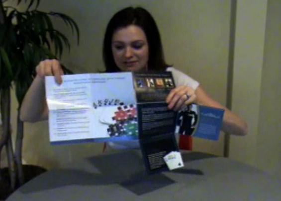
Really interesting piece of design to look at.


BRIEF 02: EXPERIMENTAL POSTER

NIESSEN·&·DE·VRIES


Graphic designers Richard Niessen & Esther de Vries
info@niessendevries.nl
 · +31(0)20 66 33 323 · +31(0)6 24 27 22 41

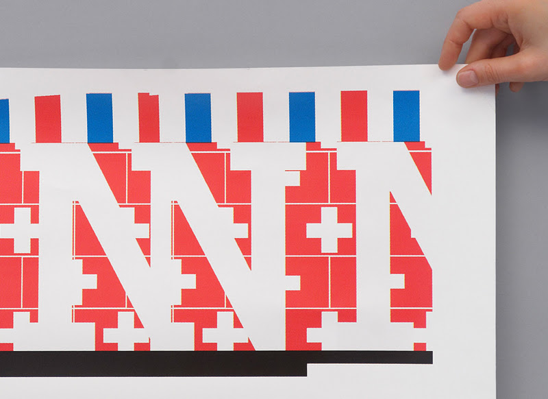
SLOGAN:'Donner au train des idées d’avance'. Slogan to celebrate the 70 years of the Société Nationale des Chemins de fer Francais (SNCF), this slogan had to be visualized on the poster.

CROPPED:the letters of the sentence 'Donne au train des idées d’avance' are cropped as if it were a panorama seen through the window of a moving train.


FLAGS:the high-speed trains of the SNCF run through eight different countries; the flags of these countries are incorporated in different patterns depicting a journey through all these countries.


The use of type is here is very experimental, the use of positive and negative space to create areas that pop and the patterns that create this visual texture over it. The colours and patterns are due to conveying the different countries, but it all jells so well together, very experimental and exciting.

BRIEF 02: SOLARSPACE

Typeface found called SolarSpace, which reminded me of my own typeface called Folded. This is just due to how the type appears to be in a kind of wave as it moves forward. The general style is very different it is just the shape the letters make that made me think of it.


SPACE FRENZY
OR
OPENING A FOLD


Here, set instead of space frenzy, OPENING A FOLD. So it is topical of my design and content.

BRIEF 02: HOUSE INDUSTRIES

Inspiration from House Industries, one of the leading type foundries today, dealing with type in quite a playful way. Here are some screenshots of the opening page, showing various products and typefaces. 


Various points of interest and inspiration, ideas of layout and playing with colour, something I need to work on.


BRIEF 02: HOUSE INDUSTRIES CATALOG

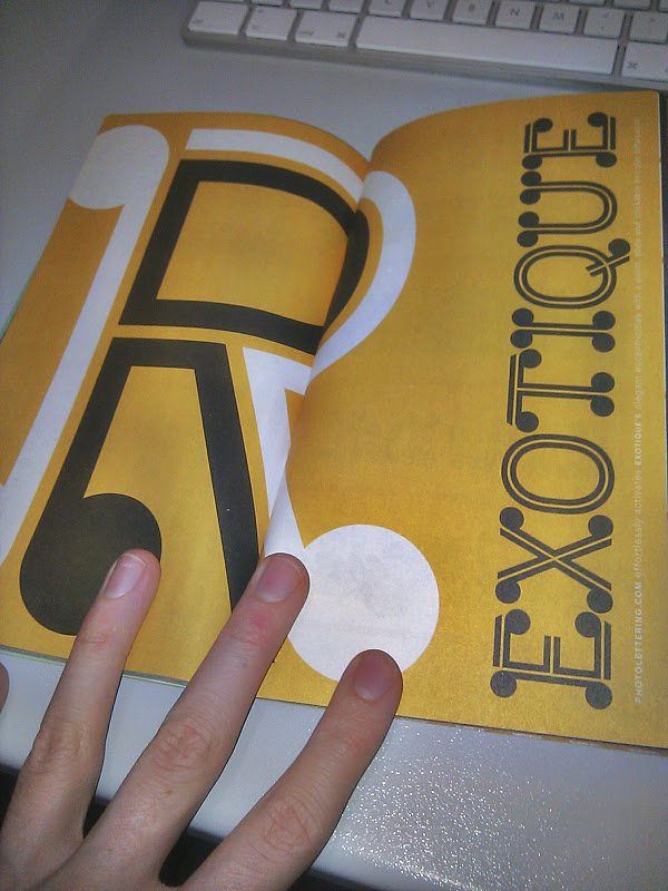
House Industries catalog, about Plinc.

Completely free and sent in the post, this catalog is about photo lettering type, so inside is just loads and loads of layouts and interesting type arrangements to showcase their type and to make it look professional, stylish and appropriate.

This is effectively what I need to do for my publication.


Some really interesting layouts, House Industries are a really good and interesting company.

BRIEF 02: HISTORY. PETER BILAK

HISTORY BY PETER BILAK


Based on a skeleton of Roman inscriptional capitals, History includes 21 layers inspired by the evolution of typography. These 21 independent typefaces share widths and other metric information so that they can be recombined. Thus History has the potential to generate thousands of different unique styles. History is available as a collection of 21 OpenType fonts that can be used just as any other fonts, and also as part of the layering software History Remixer.


"History has my vote this year. Peter Bilak’s typeface speaks to the current interest across the design fields in engaging users in the design process.
But he has done it in an astonishingly sophisticated way. By breaking down the typeface into components that can be recombined in endless combinations, he has designed an open situation rather than a fixed product. The results shown in his beautiful type specimen book are fantastic; now the test is whether ordinary mortals will be able to make it work."

Ellen Lupton.
Very interesting take on type design, to be able to create 21 different typefaces to use in any combination to make endless new typefaces from one concept. Incredibly large type brief, and executed perfectly, very effective and interesting commentary on type design at the moment.

BRIEF 02: FOLDING PUBLICATION

Found on Fold Factory.com. Iron cross with fold out posters.


FOLD of the WEEK
http://www.foldfactory.com/fotw_archive.php#


November 18, 2009  Clever Iron Cross with Fold-out Mini-posters


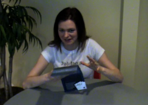
Handy little fold out publication. This was just a short run through on what the iron cross fold can do with these mini posters attached. There is a lot of possibilities to consider thinking about the posters attached.

BRIEF 02: PUBLICATION LAYOUT

Net for an iron cross fold, this is the type of publication/ outlet that I was first of all considering, something small but good layout to present work. This is the net for the document, as you can see the whole thing folds into itself.


This is an example of the publication being used, simple and effective, the colours used work really well together. The aim is to make something that flows as well as this does.


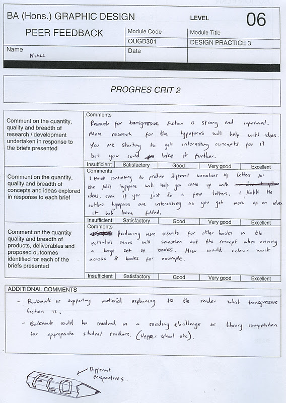
PROGRESS CRIT TWO

Second crit with the same group, yet this time Jo wasn't in and Jack joined our group. So it was Ben, Emma, Liz, Jack and myself, which I think was a really good group to crit each others work. Here is the feedback I received from them within the Crit.


I got some good feedback from the crit. So in order to make sense out of these sheets I have gone through them and just made my own quick list of things I need to do, and things I should just try out and test. 


Some of the things suggested I didn't think were entirely relevant to my work, or I had already thought about it and decided not to. Everything else is on the list that I need to get stuck in to.


BRIEF 02: FOLDED TYPEFACE

www.jeffkasperdesign.com


Typeface designed by Jeff Kasper. Deals explicitly with the idea of one single width stroke being folded over itself in order to make turns and angles. This is also explored with the use of colour, which obviously makes it easier to see as folds but not sure I am a fan of the choice. 

I like the design and the way has been done but I want to make a folded typeface that is based more on existing typefaces, looking at sans serifs.


LETTER A

Made from 180 sheets of paper, see this A spiral around as it builds. Really well crafted and good idea, the video really demonstrates how good it is.

Not exactly paper folding, but interesting all the same as it manipulates the paper.


TYPE FOLDS - ROSARIO FLORIO

As my third brief is about creating a typeface based on folds I thought this was really interesting, done by Rosario Florio, the type has been experimented with light refractions, therefore giving the type its folds and angles. 

It is a bit different from my designs and ideas because mine is looking at each individual letter separately to create the typeface where this is experimenting with type already positioned, type in context.

I do really like how part of the letters fade out, as it seems to lose focus due to the angles it has been put to.

Looks well in context of poster, good minimalist type control around main focus.