Showing posts with label BRIEF: 03 - SOFIA COOMBS. Show all posts

BRIEF 02: MADE IN BIRMINGHAM

STUDIOMAKGILL / COLOPHON FOUNDRY


Two years after creating the original identity and typeface for the Made in Birmingham exhibition, we created a more refined, commercial version of the typeface, Central Avenue.

After working with this typeface almost exclusively in black and white, we felt that it would be more interesting to explore it in colour for the type specimen. The unbound booklet also works as a series of 4 posters — abstract and bright.


Central to the identity was a bespoke typeface that we created based on the original hand-painted signs from the show. The typeface that they used wasn’t a typical decorative Victorian face, it was a simple sans serif – much more industrial and much more relevant for a contemporary exhibition.


The typeface created is strong bold, and industrial. However the colours and overlap texts makes for a really interest contemporary design. Bright and exciting, the letters sit as the composition of the page and he text is set over the top.

Try something similar myself.

BRIEF 03: PHOTO ARCHIVE


OBSERVE:All photographs in this book were taken bij Auke de Vries (sculptor, 1937 NL well-known for his sculptures in public space) between 1995 and 2005 as sketches for his work. These photographs - a selection from his photo archives.


COLOUR:Unlike an earlier booklet containing black and white photographs by De Vries, this publication is very colourful. This is because colour has played an ever more important role in Auke de Vries’s work. 16 different colours were distilled from the photographs and randomly used as a background for the photos. 


EIGHT·COVERS:Eight·covers: The books are sold sealed in order to protect them. To offer a glimpse of the content each package comes with one of the 8 different photographs.


A photo book done my the Dutch design studio, it is so easy to see how everything they do is done for a reason, and it is so handy that they explain why they have done each thing as well. Such as the colours used for the background pages of the photographs, it is to show how the use of colour was very important for the photographer, so 16 colours from the photographs themselves have been used as the backgrounds.

BRIEF 03: STUDIO LAUCKE SIEBEIN

Booklets designed for Berlin based photographer Oliver Vaccaro.

studio-laucke.com/root/portfolio-vaccaro

Simple classic designs, very much focussed only on the photographs, not trying to be particularly fancy with the typography, just a very simple classical Serif typeface, similar to Garamond or ITC Stone Serif.

It is for the most part letting the images just speak for themselves, keeping the design minimal, but not minimal for stylistic gain.


BRIEF 03: THOMAS BUXÓ X JUUL HONDIUS

Description by Buxó

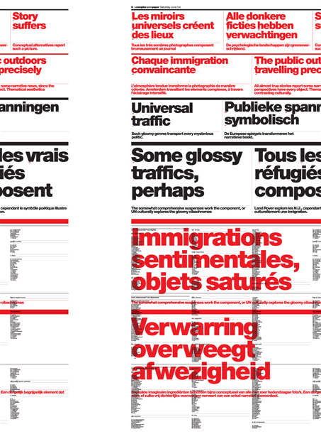
“This oversized newspaper is my reaction to the photographs of Juul Hondius (1970, NL). I asked Juul to send me a list of key words that he associated with his photographs. Randomly picked words were assembled by a software, which then generated sentences, closely following rules of syntax. ‘Confusion considers absence’ and ‘Some glossy traffics, perhaps’ are just some of the mysterious headlines resulting from the automated editorial process.” – Thomas Buxó

As he said there in the description, it is about an oversized newspaper focussed on the works of Juul Hondius. It is interesting the fact that he has been looking at automated editorial work but producing software generated sentences. But it works perfectly in how the type corresponds to whats on the page. Visually very engaging.


 Here is the work of Juul Hondius. The website is done with javascript I would imagine as it opens a new window and how it can quickly zip round to one thing or another depending on what you click on.   Simplistic, colour palette is effective, not letting any colour interfere with the work.


And here for example is one of the pieces of work featured in the work above, 'Bus'. 


BRIEF 03: SPENCER MURPHY

Website for Spencer Murphy. Once again kept very simple in navigation but in quite a different way. the homepage starts immediately with this portrait but then you need to navigate to see what else to go on. 

Portfolio is one section where you can just move along 40 or so pictures. Really simple, click left or right.


Projects section is broken down a little different. When you click on the title of the project it then comes up the number of images and able to go through them and also it can say get get info on the project.


And it also has a commissions sections, where the photos have been used within the wider cultural circle.


The website is simple and easy to use, however I don't find his online presence to be strong. The general design, typeface his name is set in is not very effective, it doesn't have too much character.

BRIEF 03: NOAH KALINA

Photographer, Noah Kalina's website. Straight away, home page consists of large image taking up the majority of the screen, leaving the navigation bar at the top. Perfect for consistency within the website, easier for the user and generally for more clearer the easier things are laid out.


Hover over the links, and it comes up with more options to view, here in Photographs it has come up with Portraits and Portraits II. Once viewing the images, the photographs appear large on screen and at the top is the option to flick through the photos by going to the left or right.

There is also a thumbnail button to press to be able to view all the photos on a grid.


Projects is the same, the same system to view the photos.


Really like the simplicity of the website and the consistency, although there was only one thing, that when viewing the Info section, the layout shifted slightly and did not continue in the same place as previous. This can be seen when looking at the heading, logo of his name.


BRIEF 03: GAVILLET & RUST

www.gavillet-rust.com

Found on September Industry, Gavillet & Rust design book box set of photographer Hedi Slimane. Quite simple but works from the composition of the photos in books, shown immediately on the front cover of the box set and each individual book, the solid rectangle where the images are positioned.

“This beautifully designed three volume boxed set presents new photographic work by Hedi Slimane, the iconic fashion designer who, during tenures at Yves Saint Laurent and Christian Dior, has infused men’s fashion with an androgynous, rock n’ roll swerve."


Another book design project by design Studio Gavillet & Rust,

"Gathering works from three decades, the catalogue was designed for Ari Marcopoulos' retrospective exhibition at Berkeley Art Museum. Awarded at "The most beautiful Swiss Books 2009" competition."


This time the layout isn't just the one style like before but ranges in how it is laid out, according to the images. The books cover really works for me, compositionally interesting and effective.


BRIEF 03: THIS STUDIO // ALAN COOK

Looking at both the design studio and the photographer they have branded. Alan Cook is the photographer and by looking on This Studio's website I have found the branding done for him, including publications, posters and his website. 

I really like what has been done, and intend on doing the same deliverables for Sofia. The publication is simple, using the same style of identity on everything, black and white with the images full page size with a slight white border so its not full bleed. Simple and to the point.


The posters are a nice touch, has a lot of impact, and using strong imagery with strong type, working with the negative space.


The homepage for his website featured here on the mac, quite different from a lot of photography websites as the first thing you see is not a selection of photos.


From the Website/ alancook.co.uk

What I really like about this website is the simplicity, all information needed is right at the top. There is simply Index, People, Objects, Places. The contact information is all there without needing to go to another subpage.


PEOPLE

As you click on people what I really like is being able to just see all the images, simply scroll down to view them all. What I particularly like is the layout of the photos, this is the same for all of the sections on the website. The size varies between about three sizes, but always aligns within the one section. 


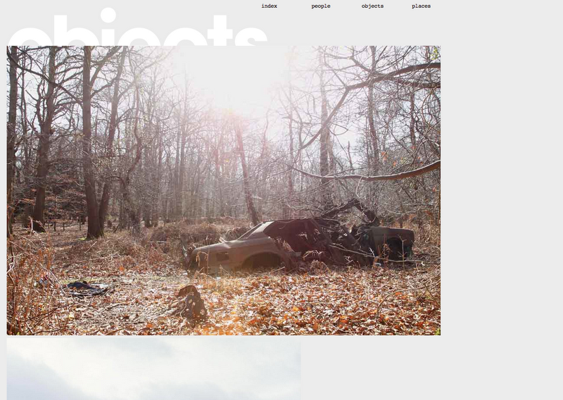
OBJECTS

Same again with the layout of the images, less is more. I find the type effective even though it sits half way behind the photographs.


PLACES


Perfect example of deliverables of branding photography. This is the range Sofia and myself have decided to do, including stationery, business cards, letterheads, compliment slips.