Showing posts with label OUGD202. Show all posts

DUBSTEP DESIGN CONTEXT

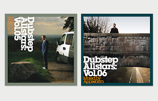
Various images on Dubstep. These are different artists albums, and design done for the sake of dubstep and others. I think most of these are really appropriate and effective, and gives me some context to work to in order to have a good design direction for my title sequence and idents.

I am mainly concentrating on type and colour choice.


These are the type of designs I really like, done by giveupart, I think they are very effective, crisp and bold. The first is one of the first and most prominent dubstep artists, and the second being one of the biggest dubstep labels there is, Tempa.


The typeface for Tempa. is Helvetica Neue, bold oblique, with its tracking altered to make it tight and together. This is definitely something I can work with in my own designs, communicating dubstep. I also  really like the choice of colour for Tempa to communicate dubstep, black red and white.

MTV WTF


MTV/Relaunch onto SKY 126 from Neal Colyer on Vimeo.

MTV's Relaunch onto SKY 126. This video came out just a few days ago, and is really interesting seeing as parts f the beginning was exactly the type of thing I was trying to create. It is a good video, and works well with the footage even though its not something I'm interested in as its not appropriate, but its the concept that I like.
The slow rotation around to a M to W is really nice actually, good steady speed which works well with the music.

RUSKO WOO BOOST

Rusko's music video for the song Woo Boost, dubstep.

The video is really interesting and oddly made, a lot of i may be footage but for the rest of it there is a lot of bright imagery for backdrops, with all kinds of shapes and waves. The colours are bright but at the same time dulled down with a lot of black used.
Works well with the song, fast and slow at the same time.

MTV BIRTH


MTV Birth from Dezi Catarino on Vimeo.

Ident found of the birth of MTV, work is a bit above my level but essences are really interesting and could be appropriate to what I want to achieve. The beginning, slow and steady is done quite nicely, to break into  an explosion through space.

BENGA - BALTIMORE CLAP


Good simple and clean cut. The colour scheme is very appropriate and thinking the timing and pace of the actions to the music is really effective.

Benga = dubstep = good.

30MOTIONS IN 30SECONDS

STEFFEN K


I think the concept of this video is really good, just one second, it is so quick, engaging and always interesting. The music to it subtle but effective, and the sound affects used are perfect. The motion done is smooth and professional, watched this so many times, it is so affective.

SIN CITY

TITLE SEQUENCE FOR

Frank Miller's

SIN CITY


The title sequence for this film is quite a straight forward clip, not showing too much, or neither telling a story but what I do like about it is the way the type works over the top of the images. By this I mean how the type in red will slowly move over the images and see how the black and white images change as you still see the image from the outlined type. Like a red filter, interested to know how to do this, especially at the end of the video, where you can only see the images within the type, but no where else.

HELLO BROOKLYN


Jay Z - Hello Brooklyn, by Greg Solenström.

Designed and created by Solenström, the video is typographic of the lyrics, over still images of Brooklyn. How the video has been made however is really well done, very nice and smooth allowing the still itself to be 3D, moving, with buildings etc having their own space.
Simple black and white, effective, suits Jay Z as well. The type chosen is appropriate and love the camera movements done in After Effects, following the type at what is often quick paced. Think the still images in the background are a really good way to simply create an atmosphere and gives more interest to the video.

MOSHUN


By Jeroen Krielaars, from Dutch design studio Calango. Similar to Alphabloks video posted but far more my type of the video, the film once again features and showcases a typeface, but how the letterforms are created within the time frame is so very effective and intriguing, appearing so simple but so clever the letters make themselves.
The contrast of the soild black bars which tend to be stems, works very well against the lower density of having the lines create the area. What I also love about the video is how during the process of making, bits and pieces come and even disappear making it even more striking.

YOUR LOVE


YOUR LOVE, single from the band The Ashton Shuffle, film designed by Maxime Bruneel.

Illustrated type of lyrics as the song goes, really exciting and impacting, it is very experimental and all vectorised creating really crisp strong imagery with its bright and bold solid colours. What I like best is the speed at which the words are communicated through cool typography and images tell a story. Works so well with the song, and really like the contrast of the constant switching of black and white for such a long time, and then from this we then get these really nice bright but pastelly colours.

FABRIC


Elevator Music Vol. 1


Motion video sampling music from Fabric's own compilation album Elevator Music Vol. 1. This encompasses various tracks from the album, and simply shows the name of tracks and artists. It is very simple and slow for most of the time as the video isn't meant to be a full on grab your attention film but more of a relaxed video doing exactly what its supposed to, sampling the music on the album.
The camera work done in the software is very effective as it moves around the type switching to different panels, which are coloured from a range of orange in gradient to black often.

ALPHABLOKS

MOTION TYPOGRAPHY by Colin Evoy Sebestyen


Creative motion typography, which has been created really well with very smooth movement. I also like how the use of colour is used in the creation of the individual letterforms, but soon disappears as it changes to the 3d type, in a plain gradient grey.
The 3d has been done very well, and is really good quality, and very effective along with the movement. However I did start to get a little bit bored as each letterform carried on evolving, nothing wrong with the video, it showcases the type well.

PHIL G

SOCIAL MEDIA/ BY PHILL G


THE BRIEF


To educate executives as to how important Social Media is when promoting and placing a new product into the market place. The brief was to simply bring the script to life via typographic treatments, iconography and animations… without aliening the viewer. The music is also bespoke and was created specifically for the film.


Using kinetic typography the film engages the viewer, it is done very well by being both visual exciting and informative. The shift from one sequence to another is very smooth and it is effective from its simplicity because its been done so well.


REVEALED/ BY PHIL G


THE BRIEF


Grungy TV programme packaging for a teen current affairs show aired on BBC2 and the BBC Switch iPlayer. Project also included logo stings, straps and transitions to complete the package.

Informative title sequence for TV programme, which is entirely different in its form compared to the previous film, aimed at teenagers its design is a lot more gritty and brash, however it is still done well and is effective. What I think I like most is the quick camera movements dashing to different pieces of type as well as the ending credits, the composition of the type moving to disappear underneath the title.

STEFFEN K

DANISH MUSIC AWARDS 09


20 second motion graphics for the Danish Music Awards, by Steffen K. I really like this video, the colour choice is really nice, and love the overprint affect done at the end. The video is quite simple but affective, just from the addition of the negative space (lines) it adds quality to the image and style.

The way the image moves from one set of frames to another I think is really affective as well as subtle. The quick flash of colours as the subject moves and the background colour changes.

MTV X 55DSL

MTV have launched five new idents, each based on one of the five senses, which represent the fruit of a new collaboration with streetwear label 55DSL...

To design these new idents, MTV and 55DSL together selected a handful of visual artists – Alex Trochut, iLoveDust, James Roper, Tei, Yué Wu and Zeloot – who each designed a T-shirt based on one of the five senses. Each artist was then paired with a motion design studio to turn their original artwork into a 30 second short film.

These are the t-shirts and the corresponding idents:

ALEX TROCHUT X SIMON PYKE


Barcelona based designer Alex Trochut, with the sense of Touch, this video has been created from the t-shirt with motion graphics designer Simon Pyke. The video explores a lot of subtlety with space and the 3d form coming out of the page which is animated. Using just primarily white it keeps the video very low key, which enhances the sense of touch as opposed to what you would picture with other senses which is soon explored in the other videos.


ILOVEDUST X ALAN BOORMAN


Ilovedust, who are such a great design company had the sense sight for their t-shirt design. For this to be created into an animation the video was bursting full of impacting and engaging images. This is to really make the most of using the sense sight, the colours are bold and bright and ever changing, one of the main concepts of the piece seems to be dealing with vortex style images which manipulate what you see.

TEI X 3DCG


The sense of smell here depicted by Tei and 3DCG, this design is a lot more straight to the point of what it is, the whole time watching it you would know but I don't necessarily think its better for doing that. I think it is a bit much even though I do like the animation, the boldness of it and how it works with the music and sound. The style is striking and quite euphoric.

JAMES ROPER X SIMON PYKE


James Roper works with Simon Pyke as a animator to help create this video from the t-shirt design, based on the concept of hearing. The video engages a lot with the feeling of sound exploding out and being able to see what comes out from that. There are plenty of things to relate to hearing such as the sound waves, I really like the style of this video, there is so much going on within the video however what is shown when and for how long has been gauged really well.

YUE WU X DIVISION PARIS/ DIGITAL DISTRICT


Yue wu designing for the sense of taste, bought to you straight away with the feeling of it being hot. When first viewing this video I thought it looked quite a bit dated, in the style of an old cartoon, with the main character very block colour for example but this changes dramatically at the end when we see him jump from the mans mouth, it is immediately a different style of animation with a lot more attention to detail.

Each animation holds the frame at a key point to finish the design, each one is very affective and striking, just in time for the actual MTV ident to be positioned. The animation has been crafted excellently to have as much impact before the MTV ident appears as well as after, when it is positioned behind.

ONUR SENTURK

NOKTA.


INFORMATION ON VIDEO FROM VIMEO


Client: Self-Initiated
Role: Art Direction, Design, Animation, Compositing
Date: February 2010
Format: Short Film 1024*576 Widescreen Pal
Sound: ECHOLAB Gavin Little

'Nokta . (Dot .) is an abstract short film project which has creative, distinctive style of production and is an improvisation of organic pieces while considering themes like power, control and luck. Using low-budget equipment and with the combination of actual camera shooting, 2d and 3d animation techniques, the film alters the reality and physics of the real world with the help of the liquid and dynamic simulations’ impact.'

A very different approach to the other videos looked at, this deals very much with image. It is incredibly sophisticated and looks very high end, the only problem is I have no idea how this video was done, at the moment it is far beyond my knowledge how to even create the images to move like this at the level of control. At least being able to read a little information about the video helps, how there has actually been filming as well as animation.

It is very impressive and immediately has high impact. One of the things I like most about the video, is simply the end credits, they may be short but I really like how its been done. From showing one frame from a distance of what  is happening with the type to immediately cutting straight to a zoomed in close up image of what is happening.

SEBASTIAN LANGE

FLICKERMOOD, by Sebastian Lange.


Typographic experiments, in motion graphics. Directed and animated by Sebastian Lange, he brings to life and explores the type fragments from a poem called Mutability by Percy Bysshe Shelley.

The type is constantly changing and evolving, it is free flowing which keeps the user engaged consistently throughout, the fact that it is done incredibly well just makes it so much more impressive. The video is very engaging, and your eye always something to follow as it goes through stages, and different affects, with all different types of motion in order for it to continue the story.

The video was created mostly in After Affects, with the type radically exploring different motions, such as zoom, blur, jumble and overlapping. I really like how the type has been explored, it is definitely one of the best motion type videos I've seen.

THE STATE OF THE INTERNET

Motion graphics from JESS3, found on Vimeo.


It explores facts and statistics about the internet and then communicates it simply as motion information graphics, creating a really interesting and visual approach. The video works with simple imagery, followed by the significantly high impact type that surrounds and works with all images/ logos and symbols.

I really like how the work is so clean cut and high impact, everything is rigid and to the point creating a much more powerful piece. The colours used are great, only using a very limited colour scheme with past of the time only one or two colours as well as black and white. This in turn makes it a lot more affective and aesthetically pleasing.

What works really well is the ever changing facts that come into play with the imagery, the constant dialogue between the two even if the speed of each are completely different they still come together to communicate.

COMMUNICATING TO A WIDER AUDIENCE

RUSSIAN


SPANISH


I wasn't expecting to see the video re-made in other languages, still done by JESS3, it is really quite interesting to see with all the same facts and same images, just a completely different language, it still been made to work just as well altering the video to make it work.