Showing posts with label COLOUR SYSTEMS. Show all posts

MAC SUITE. INDESIGN WORKSHOP

When first opening InDesign, you have three options to choose from for a New Document, these are Document, Book or Library. It is always a good idea just to use Document rather than Book, even if you  will be creating a book maybe up to 50pages or so. The Book option is far more complex, allowing use of things such as Contents, and whether you can have an in depth index.


When choosing page size it is very important to choose the exact size of the page you want to be the perfect finished printed size.

The option of Facing Pages is very important. This is where you can simply create a book, or leaflet for example. It is also easy to use double sided, but if you just want a page double sided you can just write in Number of Pages 2, but not Facing.

Columns, Margins, Bleed and Slug are all things that you do not necessarily have to use, it's up to you but depending on the work being done these options are very useful.

The bleed is so that the area can print straight off the edge so therefore when trimming to size, it will have a perfect clean edge.  Bleed is often typically 3mm, but this could always be in dialog with the printer to see what would be best.

Here on this screen grab of the page, you can see the purple line which shows where the margins have actually been set, which is equal all the way around the page. The next line which is black shows the size of the page itself. Finally the red line is the 3mm bleed that has been added to the document.

The way to apply colour and work with the swatches is once again effectively the same as using the other adobe products, just like Illustrator.  In the top left of the Swatches, you can see the fill and stroke box, where you can apply colour. Next to this is the same sort of fill application, but for type. 

Within InDesign, all colours by default are Global. This just like in other Adobe products where you can create global colours, whenever you change the mix of colour from within the swatch control it will therefore change the previous colour to the current colour selected on the artwork wherever it is in the document.

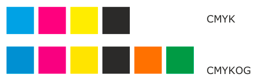
By default, the colours on the swatches include, Black, white (which is seen as paper, assuming this will be the colour of the stock, if not it could be changed to whatever it is), Cyan, Magenta, Yellow, Red, Green and Blue.
When opening an image from Photoshop, that has been previously created as a Duotone, by simply placing in InDesign the swatch window automatically updates with the exact spot colours used to create the image. All colour information is kept the same and can easily be accessible now to use anywhere else in the design. However to change any colour that is used within the image, you would need to go back to Photoshop but this can easily be edited and put back in to InDesign. 


SHORTCUTS

To quickly duplicate and and object you can hover over the image until it has just one arrow over it, press alt and it doubles up. By dragging it simply repeats the image.
Apple, Alt and 4 repeats for sequence, placing the object.

---------

When working with an image, that uses CMYK as well as a spot colour, just like in the image it is a good idea to check the Colour Separation. There should be 5 colours here to print, if commercial therefore 5 printing plates.

So by going to Window, Output and the Separations Preview you can view the exact colours that will be used to be printed.


Looking at the colour separation it makes it incredibly easy to view the colours used throughout the whole image. 
This is good to actually separate the image altogether, here I view only Cyan, as we can see the C appears as well as the image because of CMYK.


Yellow on its own, darker image and showing the Y just as clearly.


This can easily be viewed to show Cyan and Yellow to work together.


Once again Spot, but here it doesn't change any of the image at all, because it is simply used for the word and does not affect CMYK at all.


When printing in InDesign, there are a number of things that can be altered and changed to make your print best. The main headings on the left hand side of the print dialog box, that need to be viewed include Setup, Marks and Bleed and Output.

Setup is just to make sure that the paper size is set up correctly and is the right orientation. Often page needs to be altered to make sure it is centre so when you print you have enough paper on each side for things such as crop marks.

Next is Marks and Bleed, which is pretty important in professional printing as well as when preparing for screen printing for each screen, layer. Crops marks are needed for when the page will need to be cut out, including the bleed. Registration marks are what is key for lining up either commercially for manufacturing plates or for screen printing when you are applying more than one colour. These can be simply lined up and you are ready. Page information quite simply tells you what is being printed. When printing out the separated colours, each on a different page you might not necessarily know which one is which as it will print in black and white, so it very handy to be able to see the information.


When actually separating the colours to be printed, in Output, you need to make sure the scroll down menu says Sepatations. You can then see the colours separated for each page to be printed, and you can take any of these off not to print.


The angle refers to when printing in CMYK, the print in order to get a well blended colour mix is a Half tone screen. Each colour is slightly rotated in order to overlap the colours. This can be seen when looking very closely and you can start to see a pattern emerging.

KNOCKOUT AND OVERLAP

Both spot colours and cyan, magenta and yellow will knockout the colour they sit on top of by default. This the same with black, no matter what the black will always knock out other colours. 

To overlap however, you go to Window, Output, Attributes. 


By clicking on Overprint Fill, the colours that you have chosen for to overlap when printed will simply mix when they hit the paper. This is the colour you would get.

When dealing with knockout, spot colours will always sit on top and simply knockout the other colour so when you want to add a spot varnish you do not want it to takeaway from whats underneath but simply sit on top, so once again this can be done by Overprint Fill.

SEPARATIONS PREVIEW


Whilst viewing colour separations there is another option to view which is ink limit. This is the amount of ink that will be printed onto the page. The preview shows red where it will go over the allowed limit, which here is 280%. 
This will affect your print, depending especially on what stock you decide to use. Thin tissue paper would react very differently to this amount of ink compared to thick card.


MAC SUITE. PHOTOSHOP WORKSHOP

In this session we were working on Photoshop and this time around looking once again at Colour Modes, and the best way to work within the specific program to get what you want from it in order to get your work to a professional standard to be printed.

First of all Photoshops default colour mode is RGB, which is used specifically for screen. So in order to work for Print, the colour mode needs to be changed to CMYK.


As RGB is the default colour mode for Photoshop, it has a much greater use in Photoshop to CMYK, everything is coded for RGB. This can be seen typically by viewing filters and seeing quite how much use a CMYK document has compared to the latter.
Here is a very bright coloured green that is on a RGB document, as it is meant for screen it can be this colour but by converting the document to CMYK, the colour range becomes apparent to what can be printed, this is how Photoshop has changed the coding to be what would be printed.


Here is a photo which is by default RGB, like any digital format such as scanners and cameras, but in order to print this and to know what the colours are going to look like, the colour mode can be changed to CMYK.

This is the equivalent of the same image, a much darker and duller version.


To see a warning of where colour will change before actually doing so by going to View, there is an option for Gamut Warning. This is a complete accurate representation showing the colours that could not be printed the same as seen on the screen, it appears as a light grey.


There is however an option to change the colour manually rather than just allowing Photoshop to do a default colour change. In Image. Adjustments, you can then click on Hue/Saturation to edit the colour to hopefully remove gamut to make sure the image could be printed accurately in CMYK.

Alternatively you can Replace Colour which is in Image. Adjustments. This brings up this window, which is quite easy. You simply click on the area you wish to replace to remove the gamut warning, and here you can alter the saturation until it is appropriate.


By using the fuzziness slider, it controls how much of the area you have selected to replace, so once this is done you can edit both Fuzziness and Saturation to cover and replace as much of the area as you like.

This may need to go through a couple or few processes in order to change each similar colours, depending on the image of course.

At any point you want to bring the image straight back to RGB, you can go to File. Revert, which does it instantly.

The next way to view the colour differences between RGB and CMYK is to go to View. Proof Colours. You can see straight away it changes the name of the file to ...@100%(RGB/8/CMYK). As opposed to it being just one or the other Proof colours allows to view both. The image has been created as CMYK, but like before using the green that is purely RGB it is still unchanged.


Shortcuts-
To bring up Fill box, press Shift + Backspace
To use Background Fill, press Apple + Backspace
To use Foreground Fill, press Alt + Backspace
To change to default colours, black and white, press D
To switch Foreground and Background colours, press X

Whilst applying colour on Photoshop on the Colour Picker, the view box for the colour holds both New and Current.


It is in this Colour Picker when viewing all the possible colours to use, if you are on a particular colour that is RGB and not CMYK, so it would not print accurately, a warning triangle appears next to the New and Current Selection box, so you know straight away if you want to change it or not.

By clicking on the cube diagram that you can also see on the image, brings you to the closest colour that is on the CMYK gamut range so you know it will print properly, therefore removing the warning symbol.

Swatches

Photoshop always has a default list of colours in the Swatches box, to delete these in order to make room for your own selection, you have to hold down Alt and by hovering over each individual colour a small pair of scissors appear, click now in order to delete from the selection.

Having a colour in you Foreground Paint Bucket, you can simply hover over a empty space in the Swatches, this allows you to Add a New Swatch, which instantly goes into your selection.

Once again it is really easy to another way simply by clicking Add a New Swatch whilst browsing through the colours on the Colour Mixer. This can be done over and over again without leaving the Colour Mixer.


These are just colours picked up from the image was previously using earlier. 


Once again just like in Illustrator it is very easy to add you Swatch Selection just from the Drop down menu, and is saved again by default within the program folders, so easy to then again Load the Swatches at a later date.


Spot Colours

Spot colours are used to:
-Print and use colours outside of CMYK, colours like Bright and Metallic colours.
-Get consistent colour
-Be more economical, possible for less plates.

To set up Spot Colours, you can find it in Swatches just like from in Illustrator, you can choose Pantone, Solid Uncoated for example which are all Spot Colours.

When you are working in CMYK like you should be for Print, and you add a spot colour but only want to use the Spot Colour rather than using CMYK, by clicking on the Pantone colour of choice it by default appears along side Cyan, Magenta, Yellow and Black which negates the point of it if you only want one plate for the image instead of creating five.

To create an image with just one, two, three or four spot colours the image originally has to be changed to Gray scale, then in Image. Mode there is the the option Duotone.


Black will always be the first colour seeing as the image is grayscale, but it is easy to change this. Clicking on the colour, the Colour Picker will appear and just like before you can view the Swatch colour libraries, including Pantone where you can find the spot colours to choose from.
This instantly changes the outlook of the photo.


This is where you can start to add more than one spot colour over the top of each other which can be really interesting to see as the two different colours blend.


In the box to the side of the colour, there is a diagonal line, by clicking on this you have the ability to play around with the percentages of the spot colours and the different areas in which the colours are placed, such as playing around with the contrast and strength of shadows. It is just like using Curves in Photoshop to alter any image


This at any time can be restored to normal gray scale, by going to File. Revert.


There is another way to add a Spot Colour, but this is for you only want to create the spot colour simply as a selection. So you can find any section on the image you want, and grab it with any selection tool you want. I used the magic wand and decided to pick the sky. 

Once selected all I had to do was click on the drop down menu and pick New Spot Channel


This created the whole selection to be red, and be able to play with the visibility of the colour, as to how opaque the image would be, especially with there being more detail behind the colour.

When you do not want there to be any image behind the colour however, you can use the brush tool to delete the unwanted image from being red. This can be done by using the colour palette on the side, and making it default white and black. As long as the foreground colour is white you can play with where the colour lies. 

Whilst saving an image when you have used Spot Colour it is exactly the same as saving any image but it is important to make sure that the Spot Colours box is checked when saving. This will retain all of the information perfectly for visiting the program again.

SPOT COLOURS

SPOT COLOURS

For professional printing, such as in offset printing, a spot colour is generated by an ink that can either be pure of mixed. This would be printed in a single run, as in each individual plate per colour.

Offset printing processes uses and composes four spot colours, which are Cyan, Magenta, Yellow and Key (Black), this is CMYK. There are however other, more advanced processes which involve using six spot colours. This is a hexachromatic process, designed by Pantone it adds Orange and Green into the mix which allows for a greater colour gamut, creating the process called CMYKOG. These colours are added to compensate for the inefficient reproduction of faint tints using just CMYK colours.


Spot colours however are not just process colours, it is also a term in order to mean any colour that can be generated and be a pure mix. These are generated by a non-standard offset ink, that can be metallic, fluorescent, spot varnish or custom hand-mixed inks.


In any offset printing process, each spot colour needs to have its own lithographic film, and each colour to be printed will be printed using the same individual plate assigned. There are different aspects within printing spot colours that will need to be changed and vary according to its intended purpose, these include, dot gain and screen angle.

DOT GAIN (also known as Tonal Value Increase) is a phenomenon in offset lithography and some other forms of printing which causes printed material to look darker than intended. It is caused by halftone dots growing in area between the original printing film and the final printed result.


SCREEN ANGLE in offset printing, the screen angle is where the halftones of a separated colour are outputted to a lithographic film, hence, printed on final product media. Failing to use the correct set of angles to output every colour may lead to some kind of optical noise called moiré patterns. These patterns look like some bands or waves that mostly lead to unpleasant look of the final print.

Spot colours are great for perfect matching of colour, assigned from Pantone, to exactly the colour you want. Pantone has worked hard to be able to standardize and categorise all colours in order to match the spot colour print to the monitors colour. Down to obvious reasons printed colours and monitor colours are going to be different, CMYK vs RGB. To achieve a balance between what you want and what is printed, it is a good idea to have a proper monitor calibration to prove information is correct in the process of sending to print.

Generally the cost and potential for problems for a print job increase as you add more spot colours, due to the increased cost and complexity of added process inks and films, and requiring more runs per finished print. However, spot colours can be a very powerful weapon in security printing, like money, passports, bonds, and other similar prints that should be hard to forge. Money printing for example, uses secret formulae of spot colours, some of which can be seen by the naked eye, and some cannot be seen unless by using special lights, or by applying certain chemicals.


SPOT VARNISH


Spot varnishing is a special effect that puts varnish only on specific areas of a printed piece. Use spot varnish to make a photograph pop off the page, highlight drop caps, or to create texture and subtle images on the page. In page layout programs, you specify spot varnish as a new spot colour.