NIESSEN·&·DE·VRIES
2006 · Annual Report 2005 · Stedelijk Museum · 16 x 23 cm · 176 pp
Awards: Best book designs, NL · Schönste Bücher aus aller Welt, Leipzig 2007
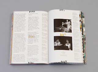
STEDELIJK:the cover of this annual report consists of nine illuminated characters: S; T; E; D; E; L; I; J and K, printed in silver on a blue canvas, these characters come back as chapter dividers inside the book.
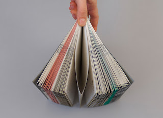
JAPANESE·BINDING:a way to bind books that gives the book a luxurious feeling; it makes the book easy to flip through; the Japanese way of binding is technically the best option because of the decorated margins.
Niessen and de Vries have created this really nice annual report, the type used on the front and back cover works really well, engaging with pattern again the design is perfectly communicating the museum, for example the use of nine blocks of pattern and nine letters in a 3 x 3 grid is to communicate the nine departments within the museum.
Really interesting piece of design to look at.


No comments:
Post a Comment