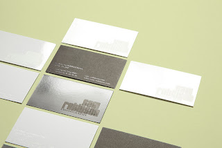
Studio Worldwide identity work for Photographer.
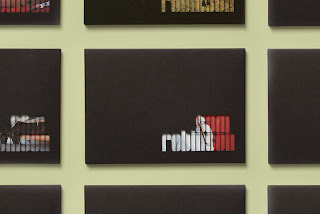
Identity work for London and New York based photographer Sam Robinson created around a logotype that is used to play with light and shadow and as a window to highlight imagery.
The promotional postcard pack was lasercut allowing a different card selection to be tailored to each prospective client.
Typeface used: Georgia
Creative use of the using his name as it is lazer cut to use it as a frame in order to see sections of the photographs underneath. Suited to the light and dark theme in which the photographer explores.
The type for his branding/ logo is really nice, bold and elegant it is effective. Unsure about the use of georgia for 'Photography'. Works well across the range, the stationary. Letterhead is clear and simplistic.
The best idea is the pack of postcards, as a set works really well how it is packaged.


No comments:
Post a Comment