Showing posts with label OUGD103. Show all posts

EDUARDO RECIFE


MISPRINTED TYPE
www.misprintedtype.com


Really like both the type and image in these illustrations, the type in particular- so delicate and ornate but at the same time had that perfect handmade feel to them. I really should just try and do more type like this  because I like it so much, just never think to do it, i should try and improve my illustrative type drawings skills.

The neutral colours work so well together, coffee stained background or collage/ composition of hat looks like just ephemeral items. Well suited to the rest of the arrangement

BOOKA SHADE

Design by UsLot Everywhere.


Booka Shade, always have this exact stylised album artwork and promotional material designed by UsLot Everywhere. It is the typography that they use that just creates this extremely bold image. The first  just deals with type, with these geometric shapes to create a very strong image, and by dealing with colour in the way that they are layout of the type can be played around with, by placing bad and love on either side of Book Shade.

The second image deals with photography starting to be placed in where the positive space of the type, but because of the nature of the type there is plenty of space for the picture to sit without being segregated too much. 
Colour is less of an importance in this design as the image is there to create a more effective image- and as the photograph is dark it sits well on this off white colour they have as stock.

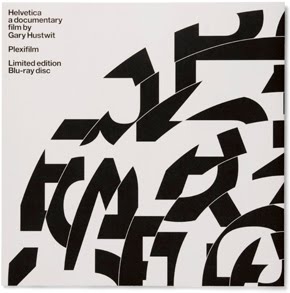
HELVETICA BLU-RAY LIMITED EDITION


Experimenal Jetset were approached in order to design the packaging and promotion for the limited edition Blu-Ray release of the Helvetica Documentary by Gary Hustwit. The concept behind the design is really strong as it depicts how Blu-Ray is just the current in format and will soon become obsolete like any format. Therefore just like a record sleeve, the design for the Blu-Ray disc mimics for the packaging for the a 12" LP.
The idea of the record relates strongly again in a different way, Gary Hustwit, when first meeting those at Experimental Jetset described the film as a 'rock documentary' but about a typeface.

This strong concept has without doubt led to a really good outcome, and is instantly recognisable as a record sleeve, and integrated the type within it really effectively as well. Broken and separated, the type is still clear to the user- anyone purchasing this would already know what it was about and because of that makes it work really well because of its subtlety and doesn't need to be in your face.

BRIAN NUDA ROSCH

S M O K E  B A T H


I found this on the website SMOKEBATH, thought it looked so good. Simple and mostly just black and white- with clever composition throughout. The website is full of photographers working with the theme of camping/ nature and exploring.


I love these photos, and just how simple the photos appear to have been put together just from the juxtaposition of two photos and the picturesque landscape.

KERRY ROPER


I think its just really powerful, I mean it doesn't particular mean anything to mean, but it is definitely a striking image- saying RIP Michael Jackson in a pretty clever way but clearly very satirical about it, the cross being used as legs is very clever. Really like it
Designing my product which is specifically about sandwiches I thought I would quickly do some research of the types of design for different sandwich makes.


Sandwich packaging for Marks and Spencer, kept really simple and to the point. The colours used are very neutral and keep the the tone of the packaging to be very sombre and easy going. Information on packaging kept minimal and branding very small.
Definitely more of an impact design for sandwich packaging, brand of sandwich clear for all to see very bold and fresh, and I just saw it writes fresh and uncomplicated food on the packaging, which sums up exactly the product has been designed. I really like how clear and standout the type is as well as the simple clean layout.


Sandwich packaging you can buy online, roughly £60 for 500 boxes. So no branding on these boxes, and again kept very minimal and with quite muted and toned down colours on each, works well with the brown of the stock. Overall they do look quite weak though, as well as the typical sort of type for that fresh feel.

FIELD DAY

FIELD DAY FESTIVAL 2010


i stumbled upon this website and i just instantly really admired the layout and design of the page. Kept so simple, and very elegant despite the words FIELD DAY being fixed to the middle of the screen in a bold red type. What I think makes it so appealing is that the type just sits there and you clearly just scroll through, the use of png images overlapping allows the type to show through on the lighter parts of the images. It looks incredibly affective and I love the simplicity and clearness of it.

COOPLANDS


Sections taken from the website, the site itself is very easy to navigate through and to use. The site itself looks good as a whole but it is very typically corporate and commercial as you might expect for chain business.

A lot of colours have been used and the type is very standout bold stencil like, trying to be as bold as possible. Clearly not my favourite type of design, but it works for what it is, it puts across exactly what message it is supposed, and I would say that would be cheap and cheerful.


THE SMOOTHIE COMPANY


Print screens from the smoothie company website, really bright as it tries to  communicate the freshness of their main shop purpose as it were. The site is quite easy navigate through, and their is a section where you can view an online menu.

Online Menu-
It has been designed quite similarly to the main design of the website, but really doesn't seem to have substance to it, very bland and simple. Colour has been played about a little in the type of the menu, arranged so the colours within words seem to sandwich as it has its layers.

The Smoothie Company also have a menu, just like a leaflet within their shop which covers everything they sell in their, which was designed by a third year here. I really like it, and I think it is a lot better than the website/ online menu. The menu is in my sketchbook, and the layout from the leaflet is so much clearer and easier to read than the online menu. Just two colours plus stock, its kept simple and bold.

BAKERY 164


Print screens from the Bakery 164 website.
The site is clear and easy to navigate through and the information throughout is easy to read and straight to the point. It has been designed to be completely akin with their philosophy of being casual, efficient and reasonably priced.


I also found a leaflet advertising Bakery 164 in the shop, which has been designed pretty much exactly the same as the  website, if not a bit more brash. The mapping used in particular, but overall it retains a lot information on it, and is quite easy to read. 


DOMINIC TREVETT


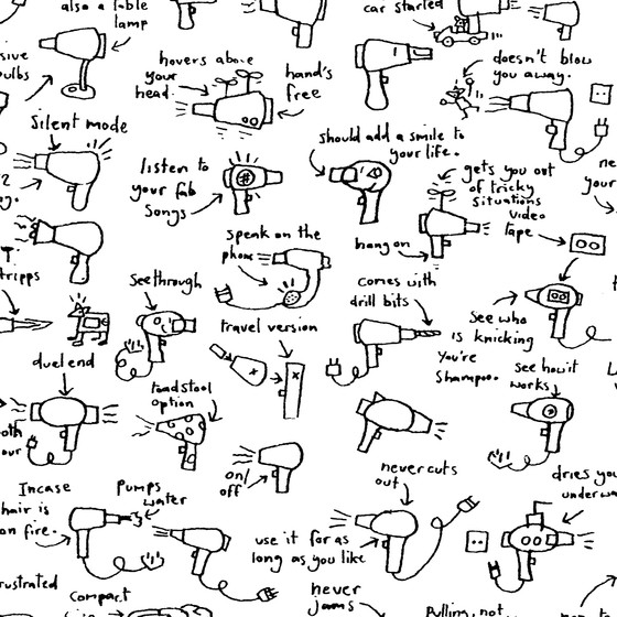
I like these maps a lot, the simplicity in the information that has been chosen to be represented through its drawings and scruffy handwriting illustrating how humorous what is being shown is. With just two colours used plus stock it is effective just because how straight to the point it is.


Quite different to the maps previously done my Trevett but in the same sort of way information is being put forward and all individual drawings seem to merge and link into another. These different ideas and uncomplicated drawings of how a hairdryer could work in weird, odd ways.

OLIVER JEFFERS

THE GREAT PAPER CAPER-
I really like the sparseness of the front, kept quite bare it still communicates the book really well. The colours have been kept quite muted and mellow except for the use of the goldy yellow used around the word 'great; which is obviously well suited and works well.

THE WAY BACK HOME-
The use of the black background, illustrating the night is really bold and stands out but is not overpowering. The illustrations of the boy and alien being kept really small on this big moon overall balance the whole image. The type is well chosen and, in contrast, in white to work with the negative of the background.


THE INCREDIBLE BOOK EATING BOY

First time I've seen i as the japanse version, I just thought it looked really interesting. I really like the normal design, just the use of the type and how the different colours and textures have been used for each word. 


SARA FANELLI

The book 'Sometimes I think, Sometimes I am', designed by Sara Fanelli. The range and combination of different illustrative type looks so effective especially with the layout. Similar to that of Craig Shuttlewood in the layout of type.


Sara Fanelli mapping for Tate Britain, once again very illustrative in its rough almost scratchy feel to it. Practically the perfect balance between being a mature design and child like imagery and roughness. What I really like about Fanelli's work is the use of really interesting background - interesting textures and surfaces that really break up the work.


CRAIG SHUTTLEWOOD

Really simplistic design of mapping, very illustrative and to the point. This is exactly how I started to think about doing my own map to represent where I would show the local sandwich shops nearby college.
I think it is very effective and works well, and I am going to have to explore further into how I should produce my map.


Not exactly mapping but designed by Craig Shuttlewood as well I think it is definitely an idea as to how you can show and represent information, something as simple as a Contents. Once again the design is very illustrative, something I want to push further within my work as I tend not to be too image based, but this style of drawing and lettering used is very effective and works really well together.

Shuttlewood's work really reminds me of Sara Fanelli, and have always liked her work. But for this piece I really like the the use of type, a bold serif typeface with a hand drawn look it is very effective with the casual change of colour for each word too, encompassed by this white space.

Melvin Galapon


Both designs by Melvin Galapon are really quite similar, I really like how the type appears to be really quite simple but actually very detailed. The colour used within the piece, works really well with a different colour for each letter.
I think I prefer the DNA piece, and the effect given from the multiple colours being used to emphasise to show the different letters contrasting from the white letters and and white/cream background. 


Typography designed by Melvin Galapon, small stickers have been used to in order to use the negative background to create the type.
I really like how its been created and effect in which it has.
However I think it might be the colour that puts me off, the blue seems to make it look quite child like.

Marta Cerd


A very illustrative type letter A, by Marta Cerda. Celtic looking and very detailed and intricate lines, the use of just one colour works really well and creates a nice simplicity.
I would like to be able to improve skills such as this, as I never really do illustrative pieces like this.

ilovedust

Really interesting type- Learnt it, Know it, Love it by Ilovedust.  The use of line in background and foreground is very effective- almost as if it has a dirty background where you can see the diagonal lines forming patches.

The type is really thin and quite futuristic almost, the colour is very standout but works well with just the black lines of the design.
TYPE

Alan Kitching
Printmaker, Alan Kitching, renowned for his letterpress has produced this piece for New Theatre. I love the quality produced from the print itself, the patches missing adds such a raw quality and definitely makes it more of an affective piece of design as opposed to if its was a solid print out. The design is trying to speak of 'new' and the transformation, this can be seen through the main body and its style but it is very different to the small heading of text at the top. The colours used are really effective and the exclamation clashes enough to make it stand out but still it goes incredibly well.


Another design by Kitching with more impressive letterpress, the repetition of each letter in a cycle of five different colours creates a really bold image. It is quite hard to read- certainly at a quick glance but the letters and how they overlap are there to give that sense of confusion and almost creates a pattern right through the centre, almost as if it were a spine.
I really like this design, and the way in which its been achieved.


Craig Ward


Quite unlike the print works, this has been constructed with cardboard boxes by Craig Ward for Computer Arts Project. Through a series of different shaped boxes, the number 50 has been made, and despite the idea of card boxes it does look quite elegant, positioned well and photographed. I'm not in photography too much, but the lighting used here is really effective.


James Taylor
I never produce graphics like this, but whenever I see lettering such as this I always wish I did. Bright and bold illustrative letters, with little to place them together- think it works really well.
Russell Weeekes


Very simple and to the point design, I like how clean cut it is. Working with the very familiar layout for the series of 'Letter is for...', been broken down by changing what we expect to happen. The font used for 'rebel', done in a scruffy handwritten way to extend what we see as a rebel works well for the overall desired effect. I really like how the lettering has been done, no block colours, but the shade has been added through line.