
Looking at both the design studio and the photographer they have branded. Alan Cook is the photographer and by looking on This Studio's website I have found the branding done for him, including publications, posters and his website.
I really like what has been done, and intend on doing the same deliverables for Sofia. The publication is simple, using the same style of identity on everything, black and white with the images full page size with a slight white border so its not full bleed. Simple and to the point.


The posters are a nice touch, has a lot of impact, and using strong imagery with strong type, working with the negative space.


The homepage for his website featured here on the mac, quite different from a lot of photography websites as the first thing you see is not a selection of photos.

From the Website/ alancook.co.uk
What I really like about this website is the simplicity, all information needed is right at the top. There is simply Index, People, Objects, Places. The contact information is all there without needing to go to another subpage.

PEOPLE
As you click on people what I really like is being able to just see all the images, simply scroll down to view them all. What I particularly like is the layout of the photos, this is the same for all of the sections on the website. The size varies between about three sizes, but always aligns within the one section.


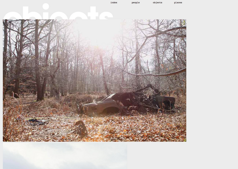
OBJECTS
Same again with the layout of the images, less is more. I find the type effective even though it sits half way behind the photographs.

PLACES


Perfect example of deliverables of branding photography. This is the range Sofia and myself have decided to do, including stationery, business cards, letterheads, compliment slips.
No comments:
Post a Comment