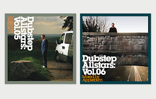
Various images on Dubstep. These are different artists albums, and design done for the sake of dubstep and others. I think most of these are really appropriate and effective, and gives me some context to work to in order to have a good design direction for my title sequence and idents.
I am mainly concentrating on type and colour choice.
These are the type of designs I really like, done by giveupart, I think they are very effective, crisp and bold. The first is one of the first and most prominent dubstep artists, and the second being one of the biggest dubstep labels there is, Tempa.
The typeface for Tempa. is Helvetica Neue, bold oblique, with its tracking altered to make it tight and together. This is definitely something I can work with in my own designs, communicating dubstep. I also really like the choice of colour for Tempa to communicate dubstep, black red and white.


No comments:
Post a Comment