
We were specifically looking at the Colour Mixer and the Swatches. Creating any document on Illustrator and setting it up for Print, the default colour mode used is CMYK, also known as Process Colours.
When choosing a colour for an object for example, it can be easily changed in the colour mixer, by altering the each slide of CMYK. You can either change the colour from something completely new or Illustrator has a default of a range of colour swatches, this can also be added and saved from ones you have previously used.

Colour Mixer
To set up my own choice of swatches that could be suitable for my own design, making sure everything is completely accurate I deleted all default swatches.
 To create a new swatch it is really easy to pick from the drop down menu New Swatch.
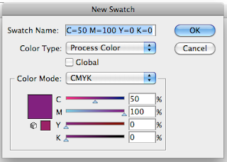
It is important not to change the name of the new swatch as it makes it incredibly more easy to have the CMYK percentages available to see and therefore keep a constant track of the colours you are dealing with.
When you are creating work on the Art board and you have just been using the colours from the CMYK mixer, and maybe a have a few different colours, these can easily be transferred onto your Swatch selection by once again using the drop down menu, but this time clicking on Add Used Colours.
This adds to your swatch list and automatically sets the colours to be Global.

This means that if you are on the Swatch selection, you can double click to bring up Swatch Options for this colour, and by changing any of the CMYK values, therefore editing the colour and by clicking OK, it automatically updates this colour if it has been used anywhere on your artwork.
This is incredibly handy without needing to select anything on the artwork, especially if the work might be quite complicated.
A tint can also be created, once it is made Global, by clicking on the colour in the Swatch menu and then the colour mixer is different now it is Global. You can change the tint, by altering the percentage but without changing any of the CMYK values.

On this mixer you can click on the drop down menu and go to Create New Swatch.
This creates another swatch that has been duplicated from the original colour that is exactly the same just a altered percentage of tint.
Spot Colours.
Spot colours are not mixed with any CMYK colours, it is a already mixed colour. By this it will be used as a single run. By using spot colours you can use colours that couldn't be achieved with CMYK, you can create colours that are incredibly bright, metallic, fluorescent or even a spot varnish.
They give you complete accuracy. If you are working for a company, no matter what, the colour of the brand would need to be the exact same. Whether the product is for poster, to a carrier bag to a pen. The print needs to be consistent.
By using spot colour, Cost and Accuracy are the two main reasons for doing so. If you are producing an item of print that requires 4 colours, but one of them needs to be a spot colour because you want it metallic then you might as well use all spot colours as other wise you would be using four from CMYK and then adding the spot colour as well, which would need five plates rather than just the four. Using different tones of spot colour wouldn't require any more plates either as it is the same colour just a different concentration. It would not be economical printing to use CMYK as well as spot colours.
In the general swatch menu, the drop down menu leads you to Open Swatch Library, this leads you to all kinds of different swatch groupings, including Colour Books, where Pantone can be found. Pantone is the largest standardisation and organisation of colour reproduction for print.

There are quite a few different Pantone options to create, and to therefore have an option to choose from Swatch to use as your print. Each library is perfectly created for however you are planning on printing, the ink and stock.
Here I chose PANTONE process uncoated which is CMYK.
but, whereas PANTONE solid uncoated would be Spot colour.
The uncoated refers to the stock used, the paper would not be coated or treated, so by viewing an actual Pantone booklet you could track down and match the colour from the screen to the perfect colour how it would be printed professionally and be seen on the paper.
Here is the swatch choice from PANTONE process uncoated.

or a small list view to see the actual names of Pantone, to go and view in a booklet.

By simply clicking on the colour viewed from Pantone, it adds it to your Swatch Library ready to be used whenever needed throughout the rest of your design.
When going to the printers, if you want a Spot Colour Varnish in a particular section, this would need to be done using a different plate, so by simply communicating with the Printers they can tell you the best way to do it, but most commonly the area you want in varnish you can create in a different colour to that you have used anywhere else and simply say this particular colour is to be Spot Varnished, rather than the colour chosen.
When you have your colours all picked and ready to carry on with your design, or will be needing the Swatch selection again at a later point, maybe for a client you can easily save the selection into Illustrator so it remembers everything you selected.

This by default because you are saving it as an Illustrator file will try and save it with Illustrator files, which is fine so it can then find it easily when you want to open it again. Which is done really easily by going to Open Swatch Library again, but this time going to User Defined, then you will be able to see the file you saved.
To save your Swatch selection be opened up in another Adobe program, you simply need to save the file as ASE instead of AI, this lets you save the file anywhere that is easiest for you. Opening the Swatch selection in other Adobe programs such as InDesign is pretty much the same process as in Illustrator as all the programs of Adobe have been orchestrated so well.
No comments:
Post a Comment